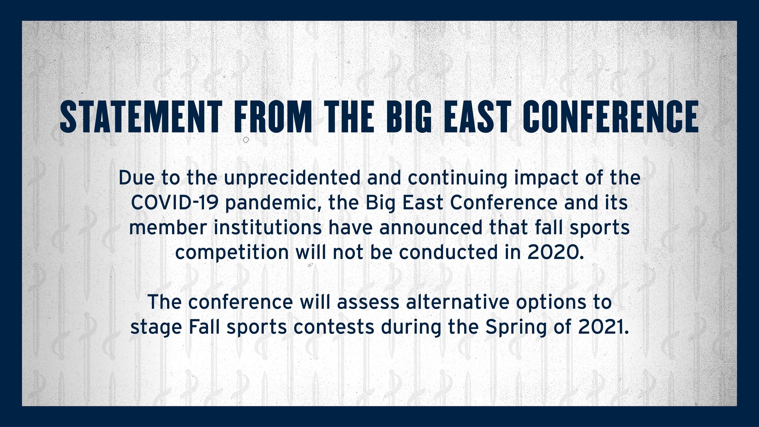
Xavier Athletics brand refresh
Going into the 2020-21 school year, the Xavier Athletics staff made the decision that the brand was in need of a refresh. To move the brand forward, the main goals were to simplify brand elements, improve usability of assets, and ensure the brand screams “SPORTS!” when you see it.
Textures

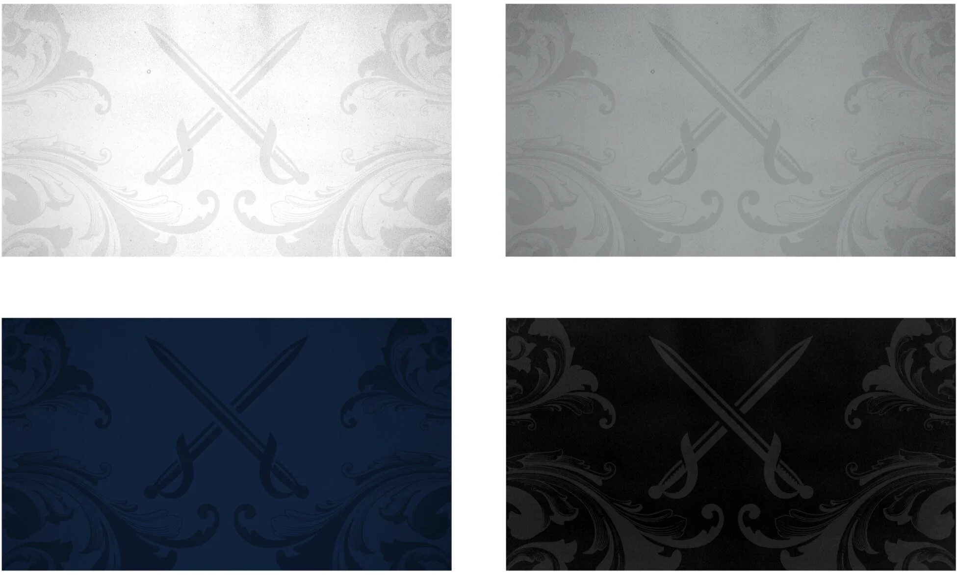
New flourish + swords
The new flourish represents a simplified version of the previous design. This new design was created with subtlety in mind, allowing it to be used as a background element that can be carried through the entire brand. With a new composition, refined flourishes, and the addition of swords, this element has become the core of the new branding.

Patterns
Patterns have become a huge part of the Xavier Athletics branding. Drawing inspiration from The Three Musketeers, campus architecture, and the Baroque style of the 17th century, 4 new patterns (top row) were added to the collection.

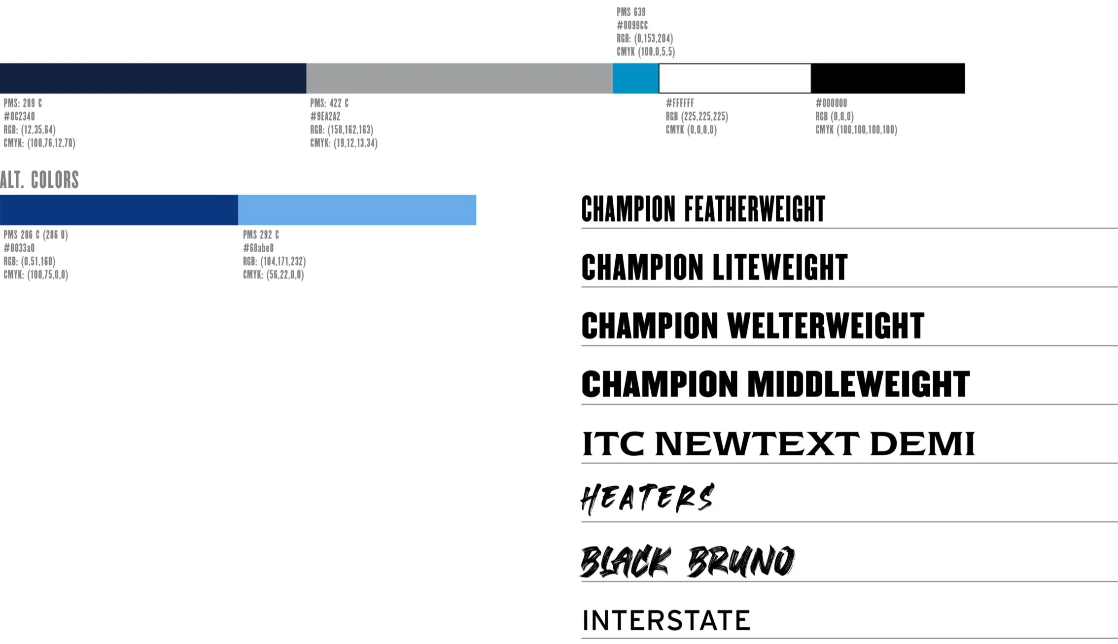
type + COlor
To build upon the traditional navy and grey, a secondary blue was added to the color palette. This brighter color comes from the university branding and will add a pop of color to liven up graphics. In addition to a new blue, several lighter weights of Champion were removed and the brush fonts Heaters and Black Bruno were added.
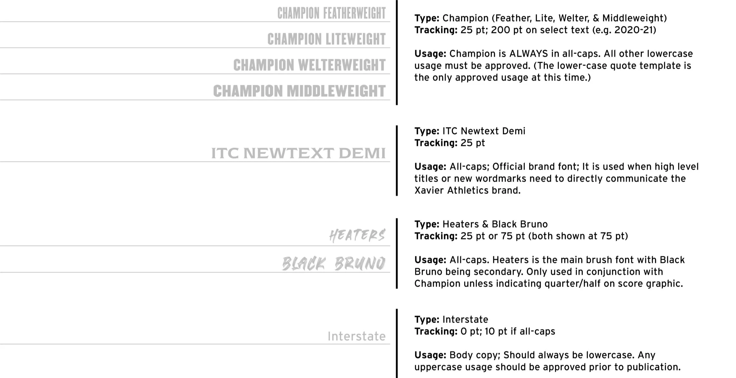
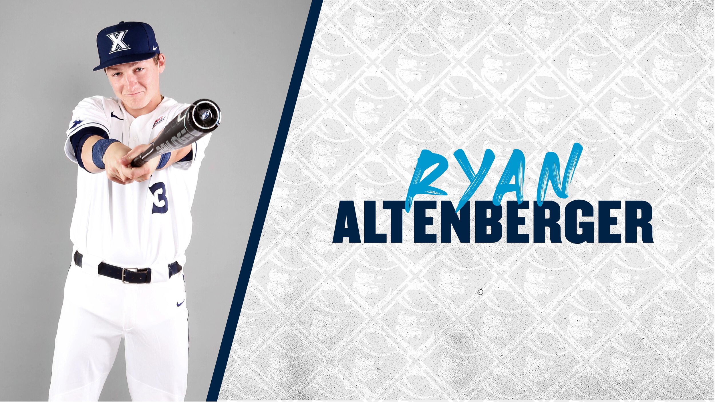
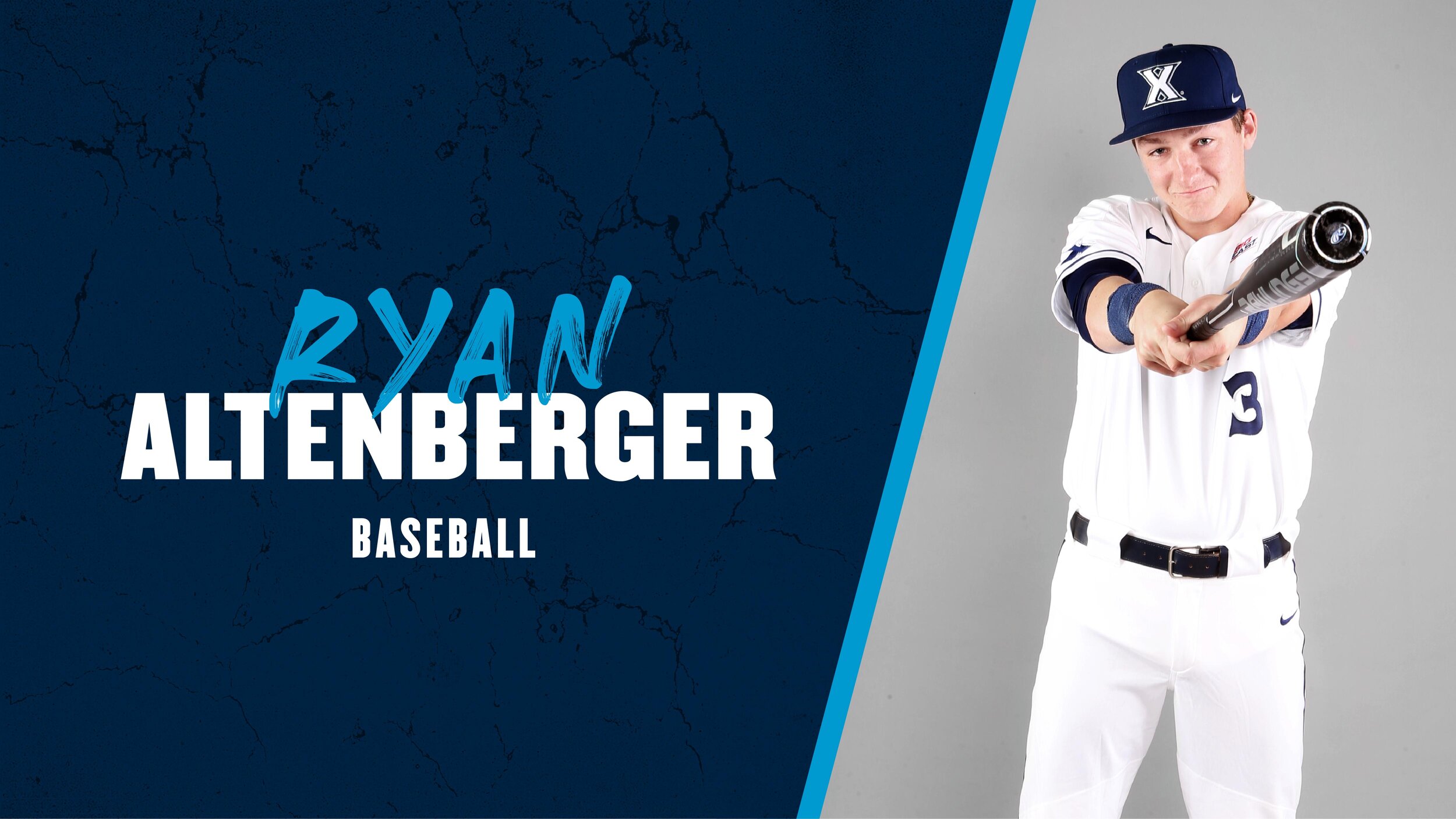
type standards
typographic texture
In contrast with the 17th century inspired design, this typographic texture was created to bring the brand forward to current times. This style can be applied to any typography including player names, sports, awards, and more.

standard backgrounds

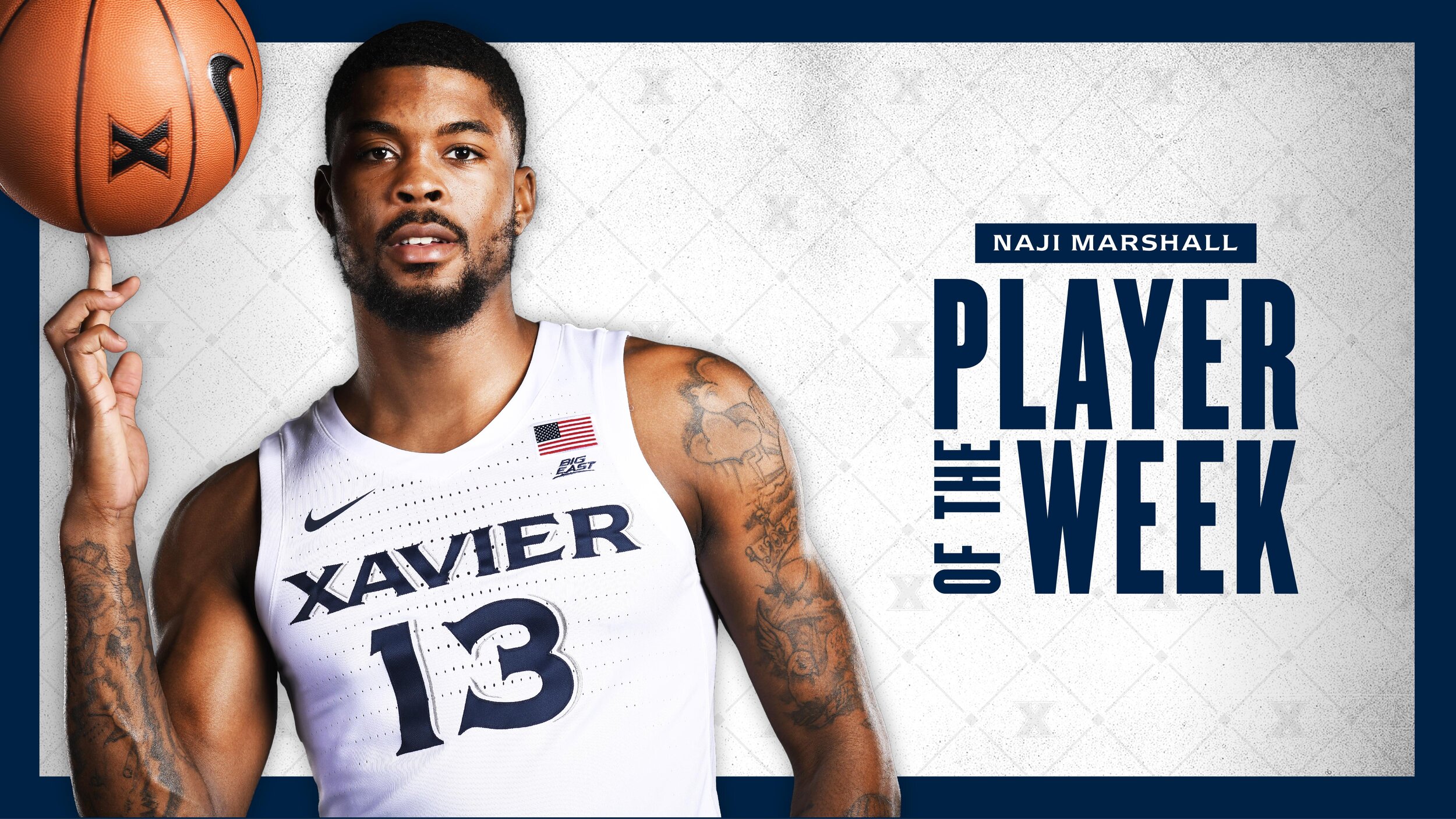
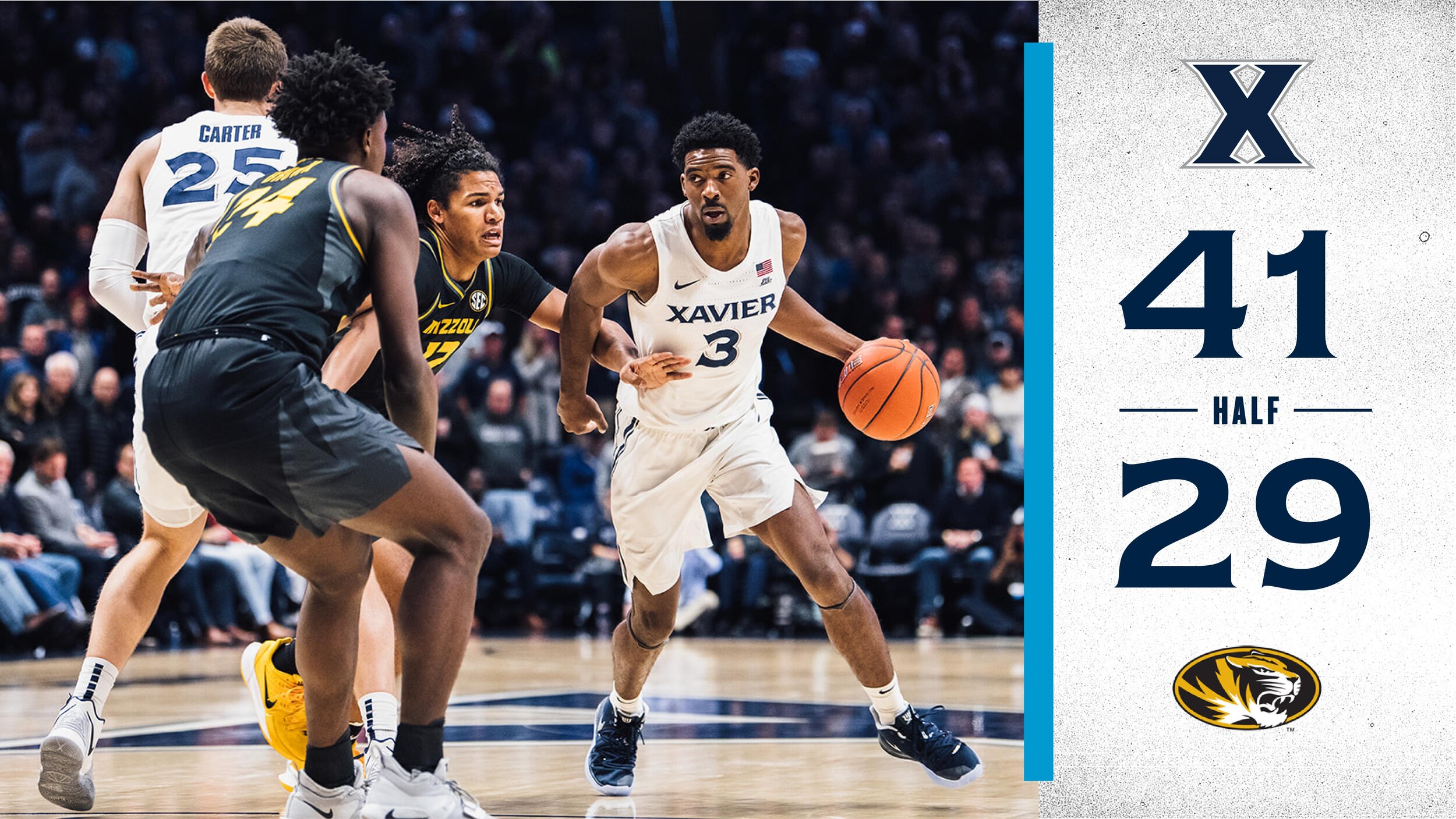
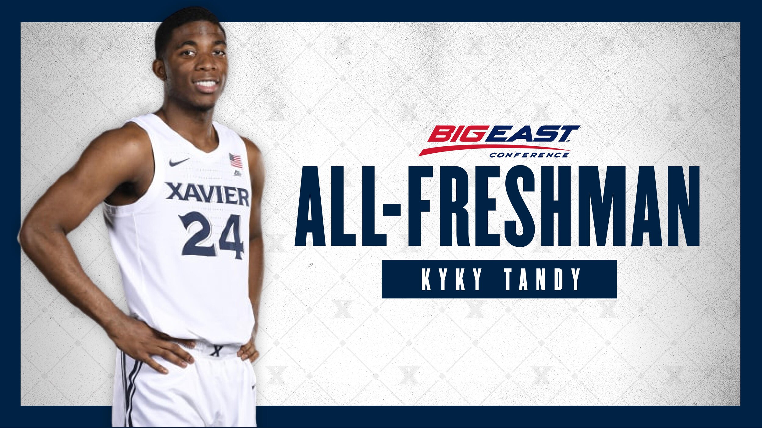
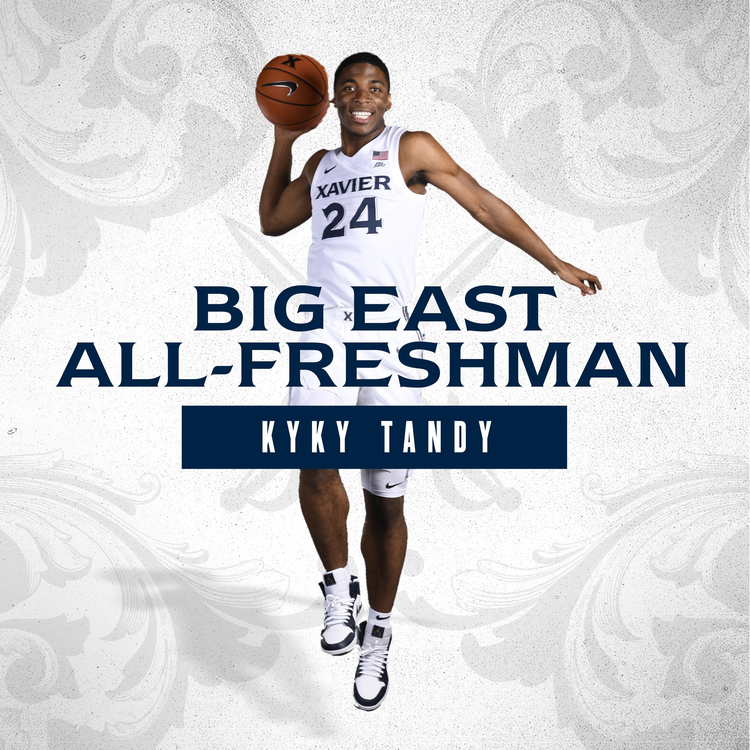
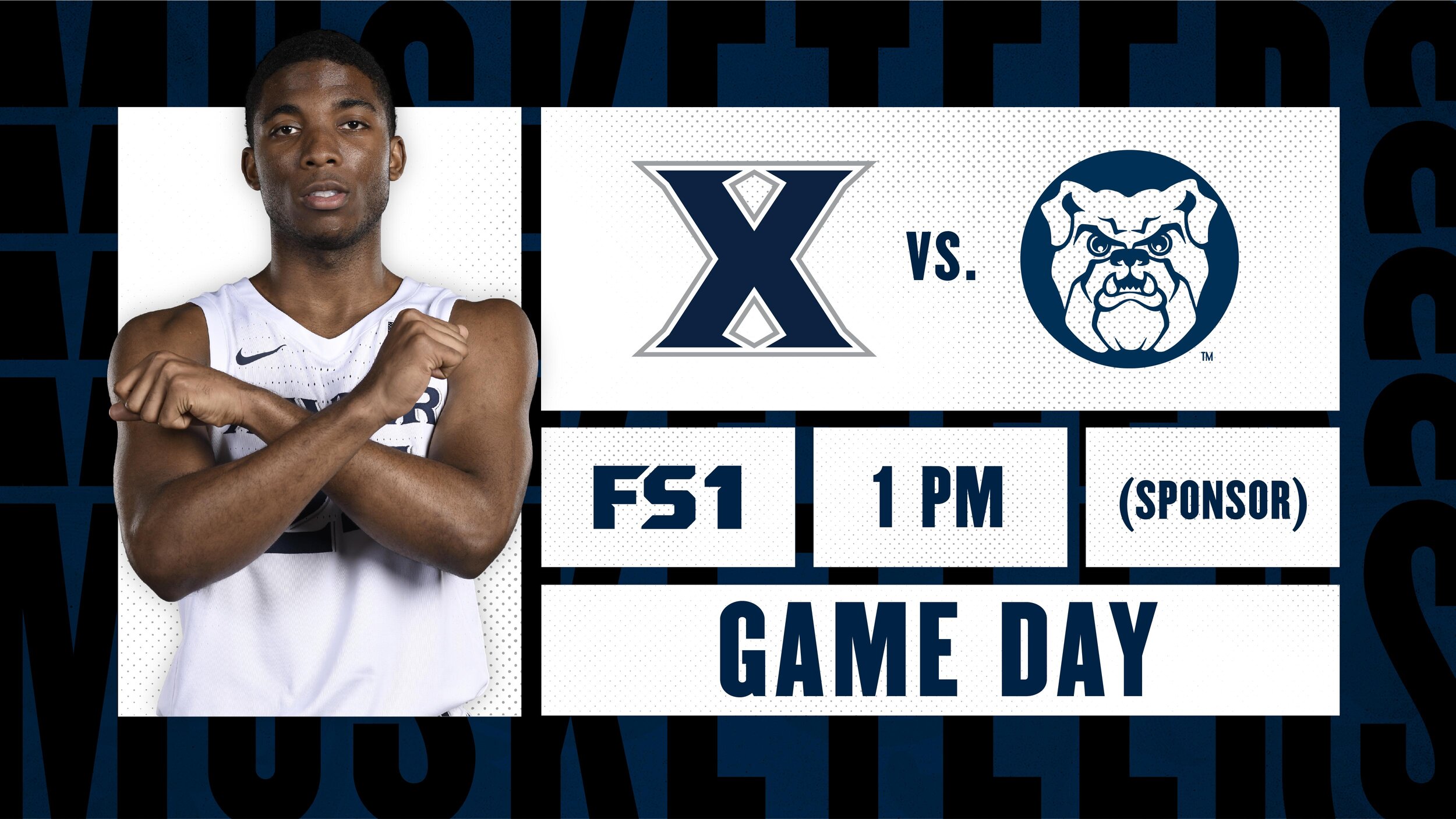
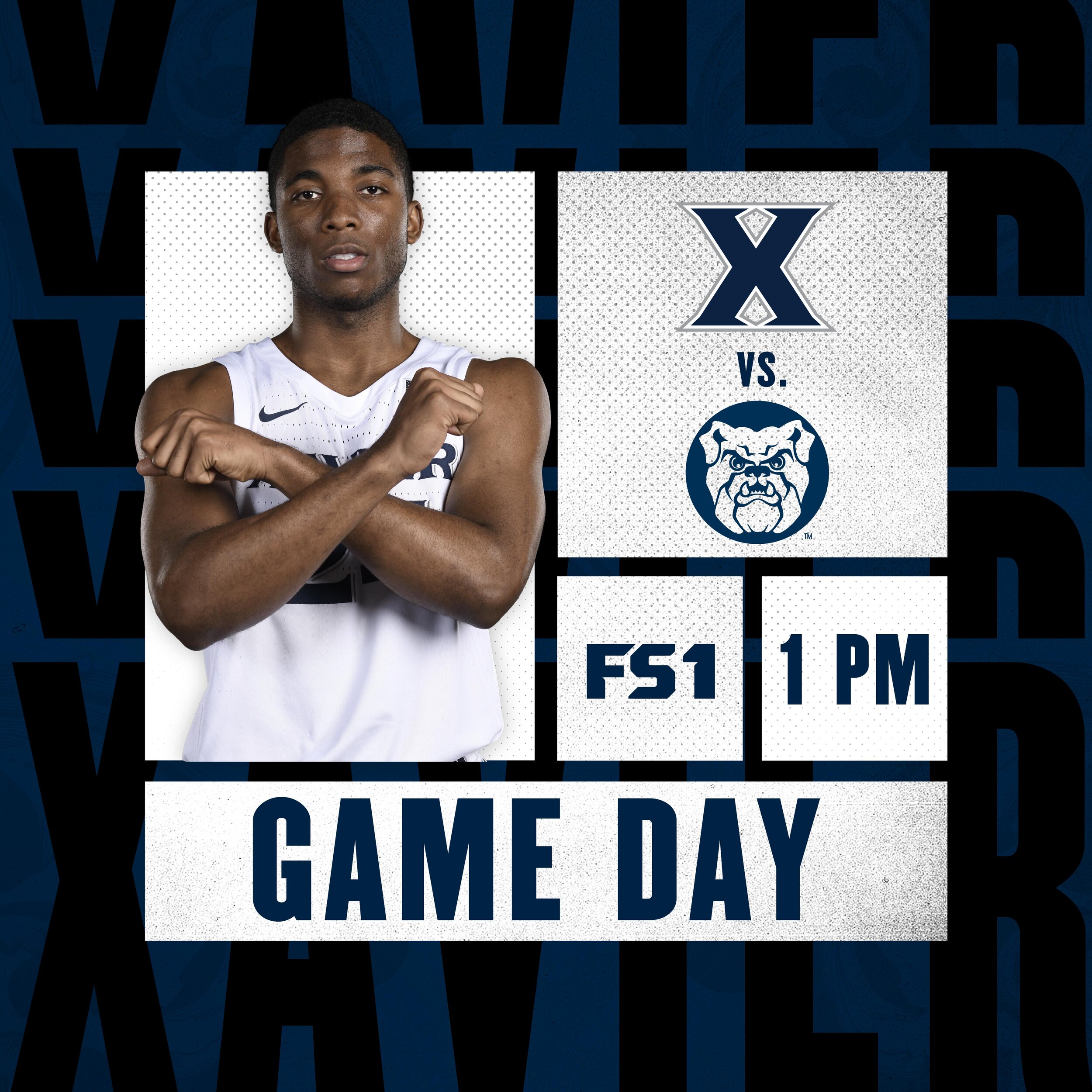
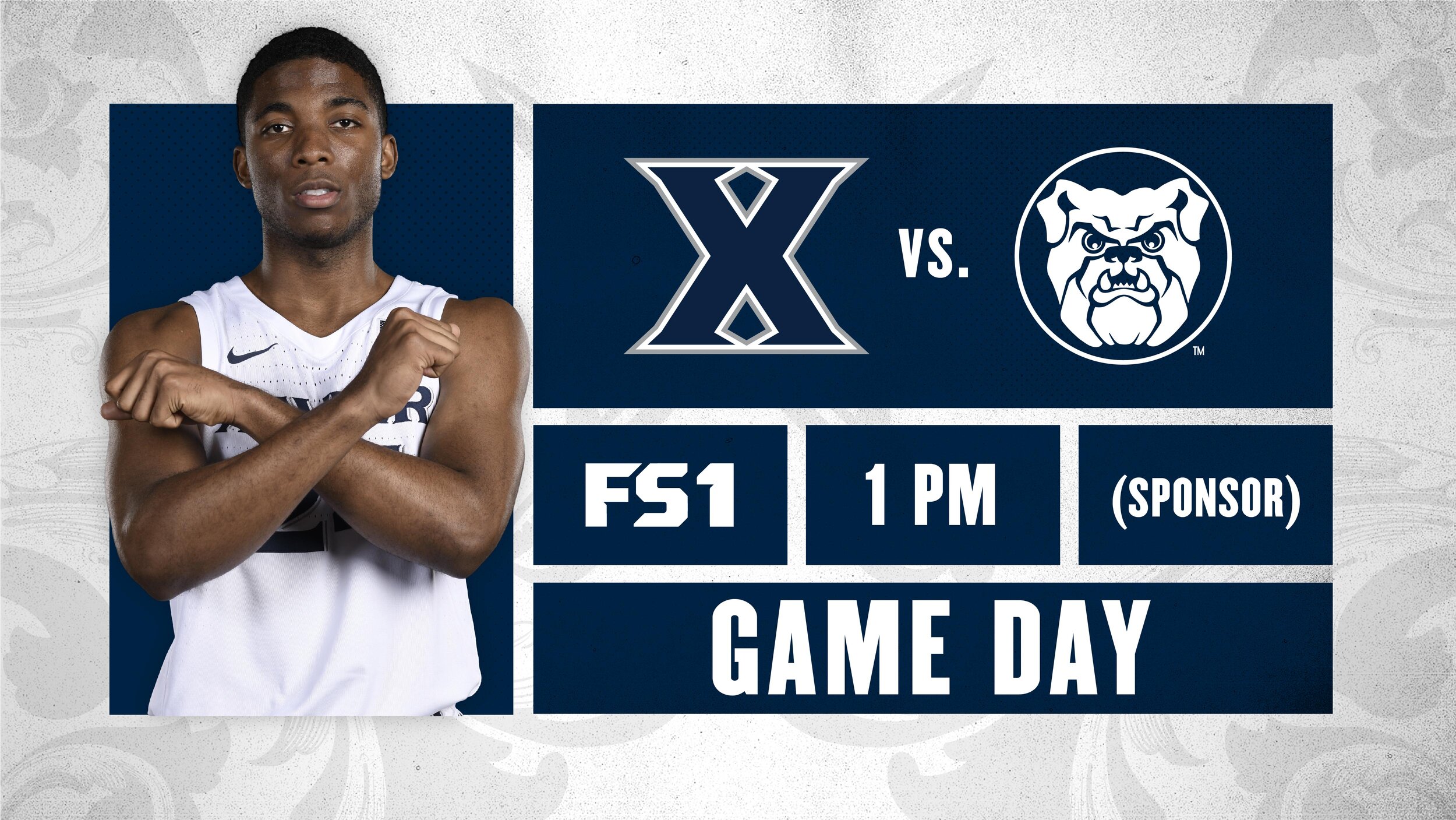
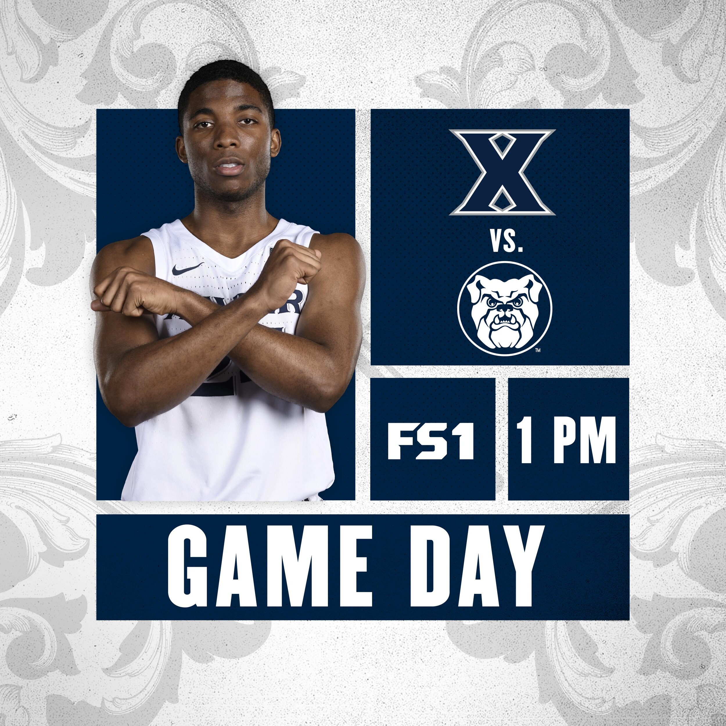
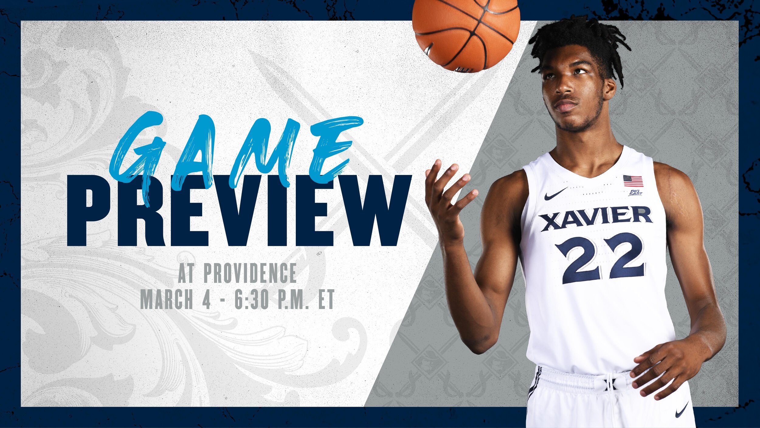
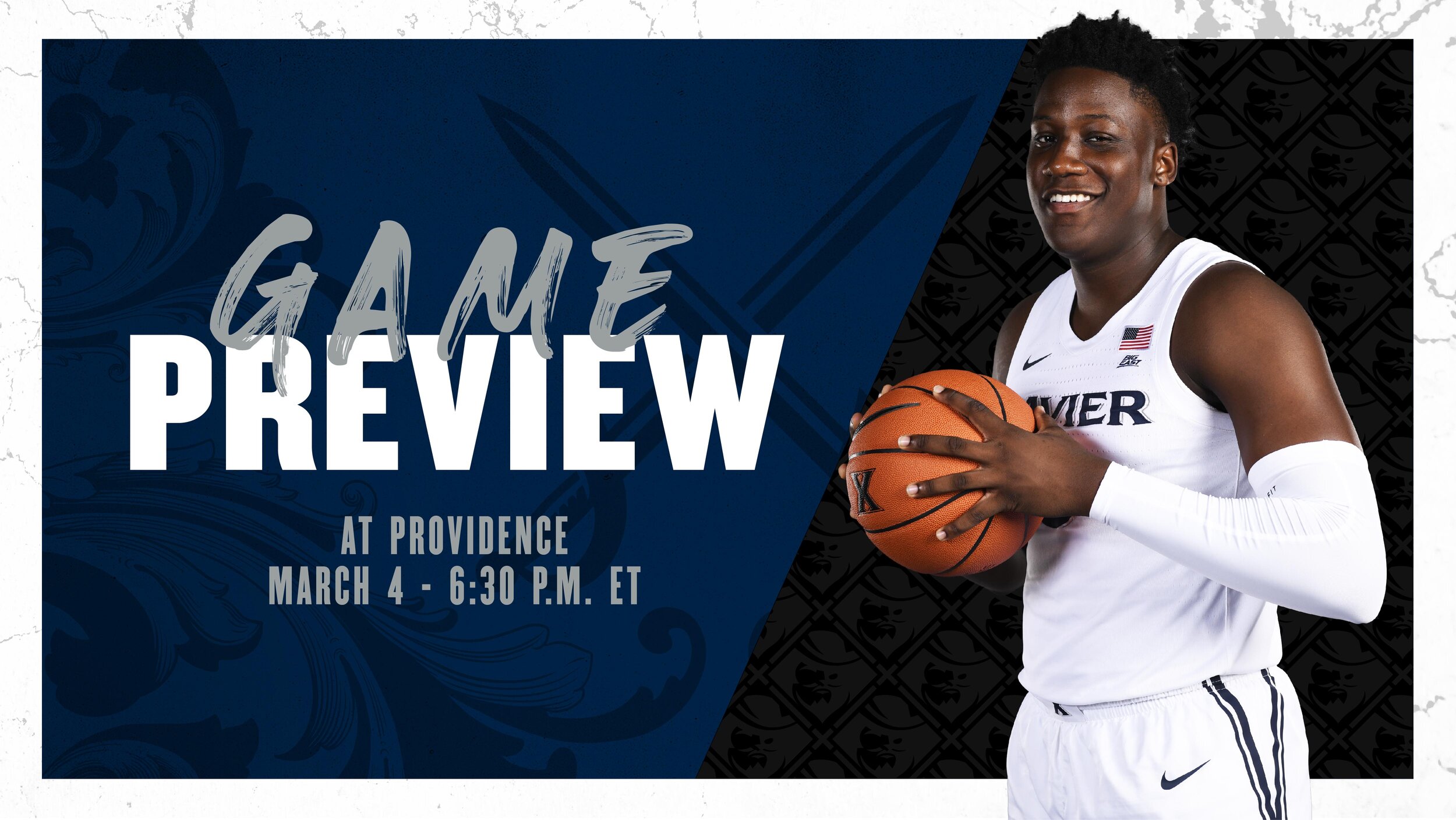
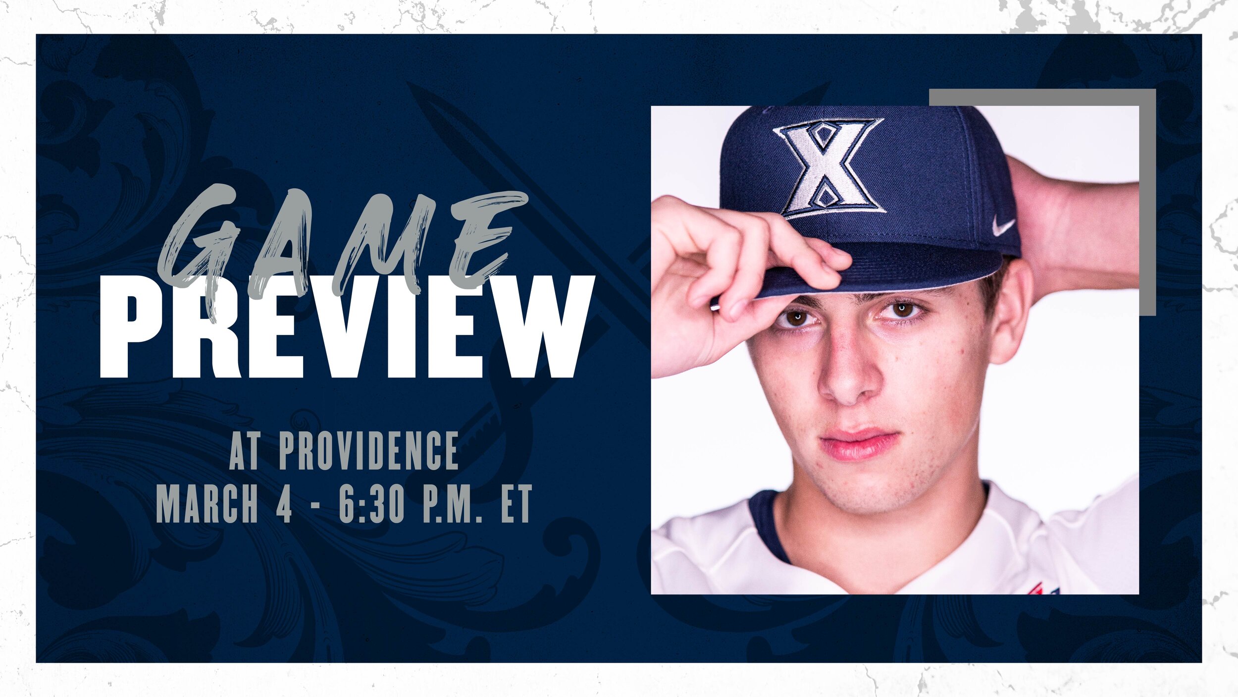
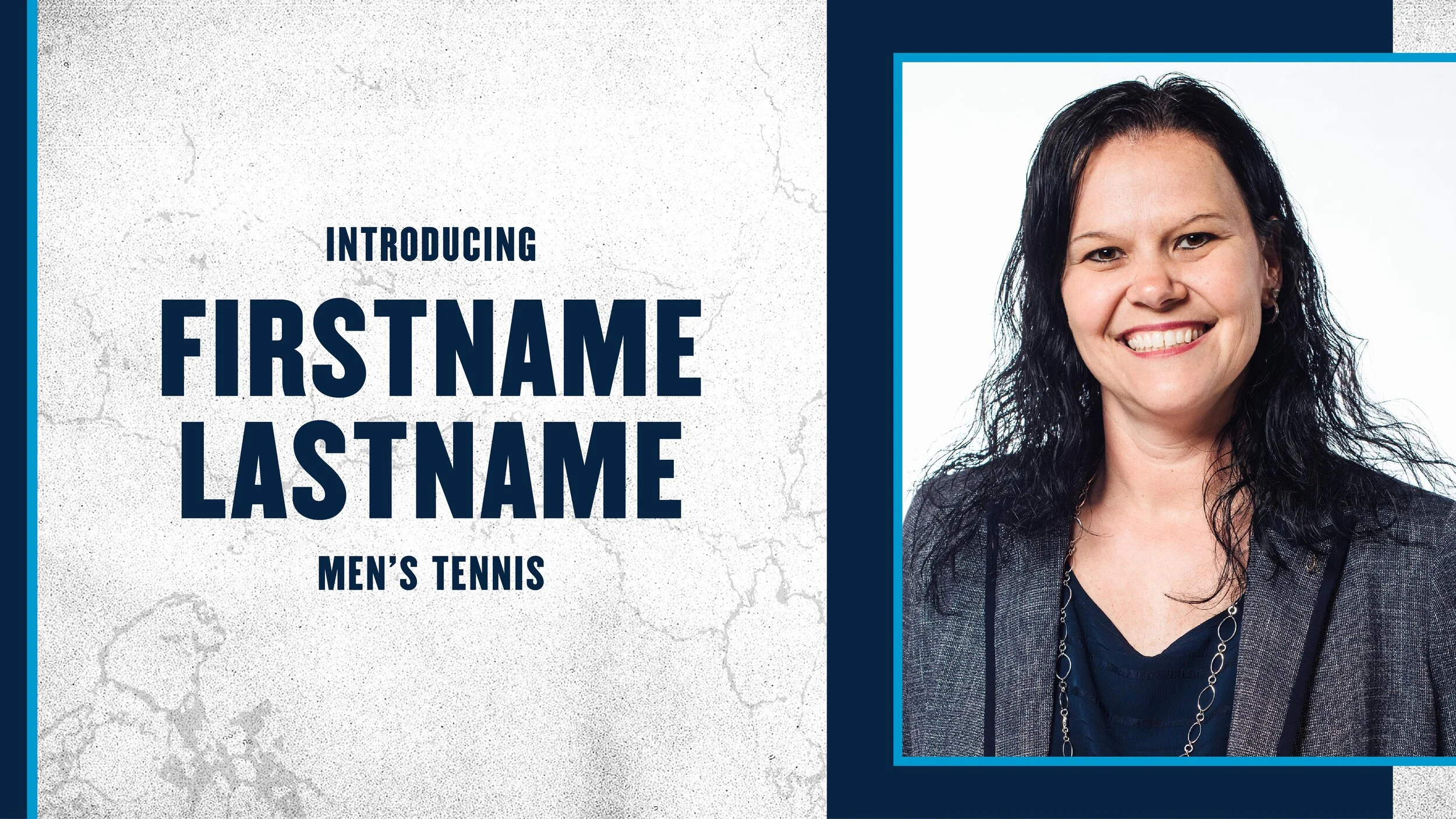
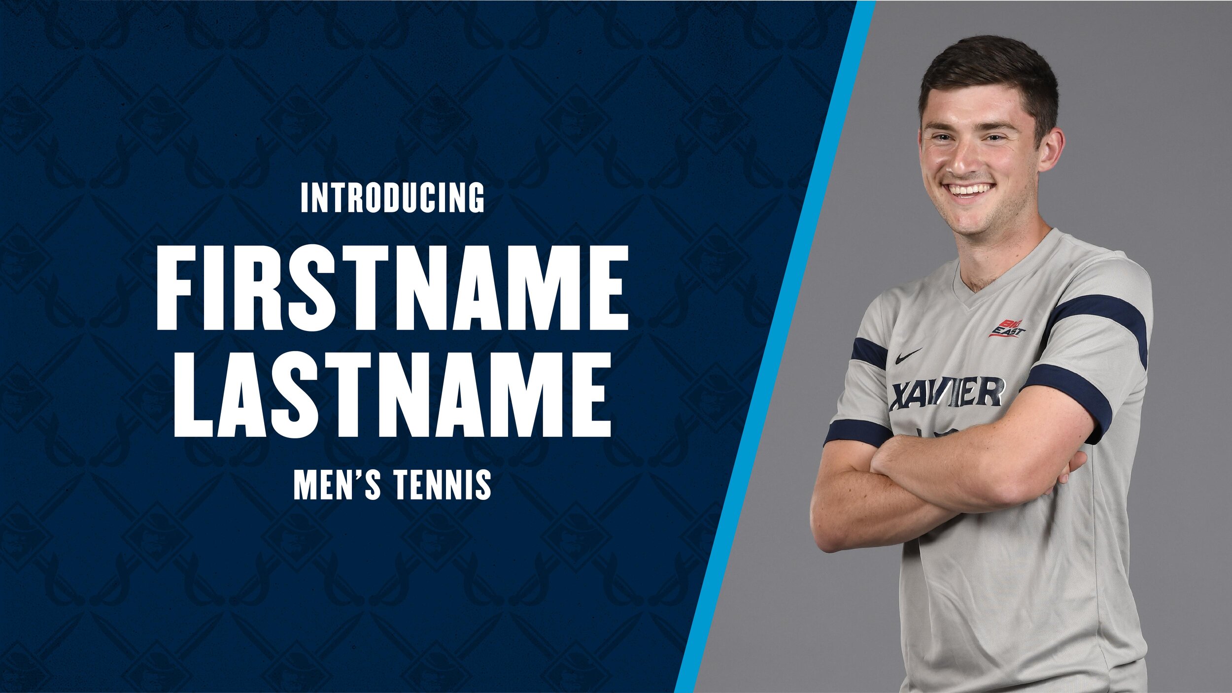
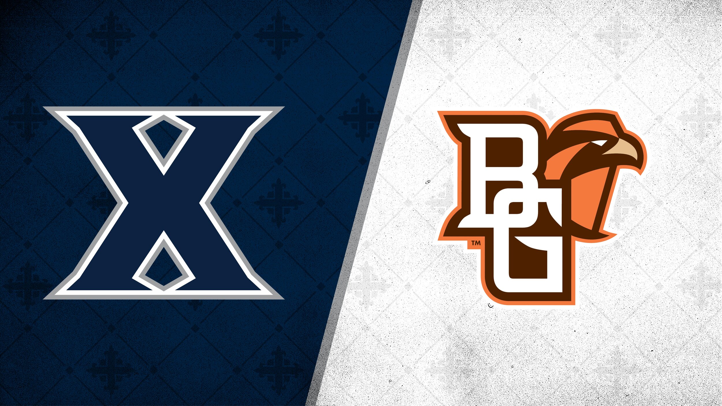
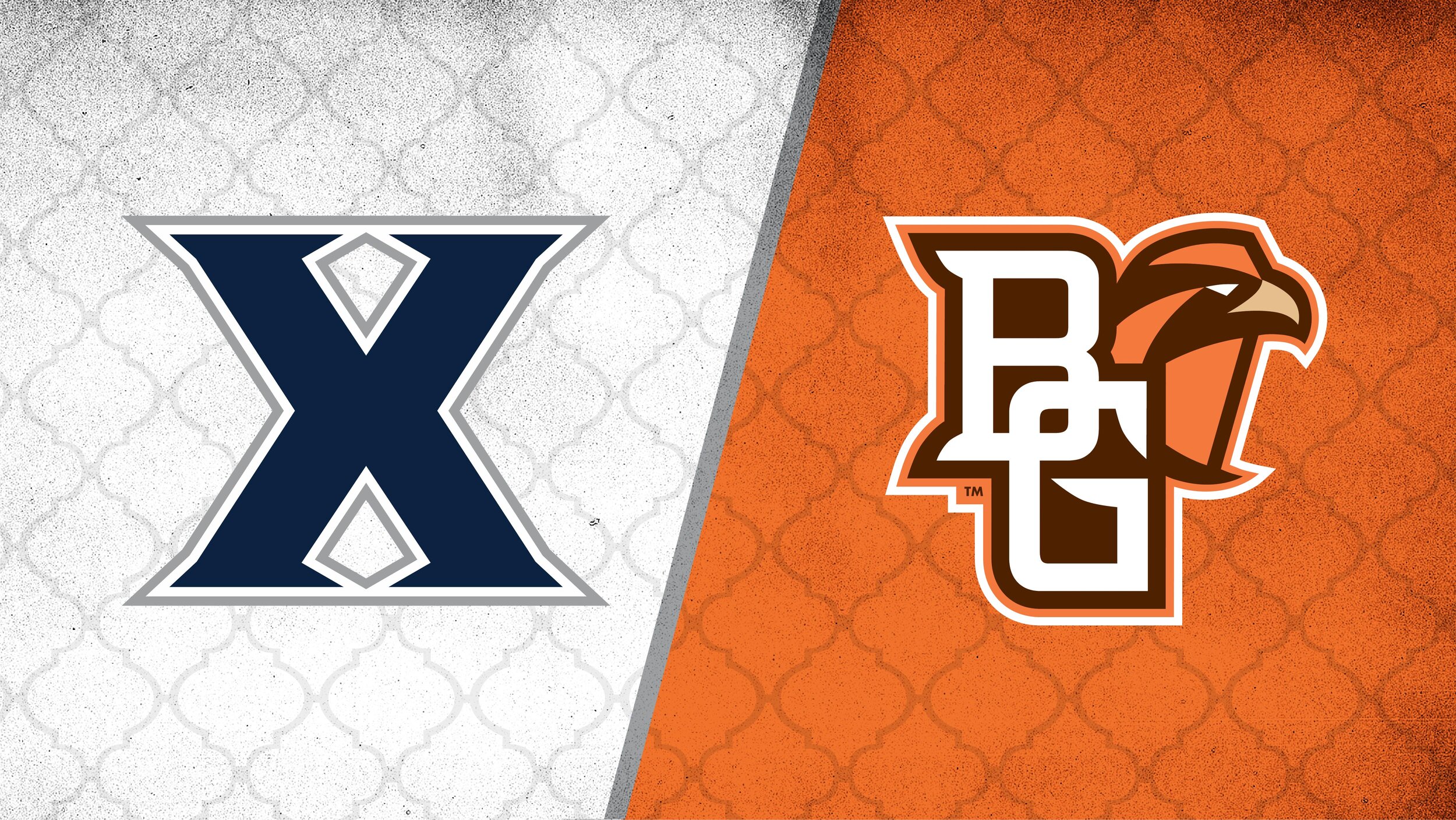
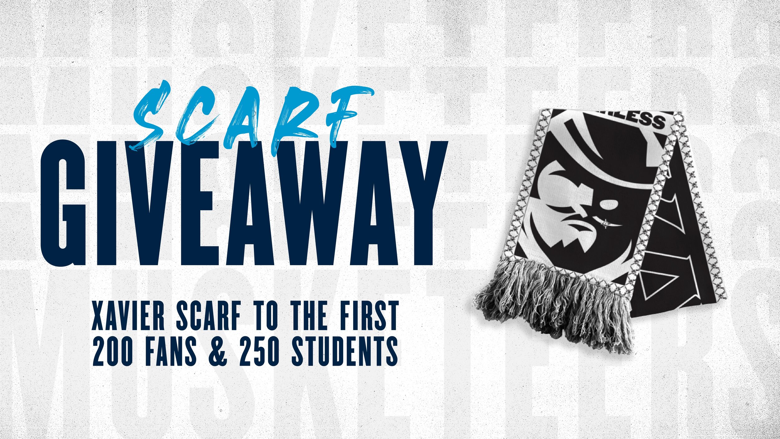
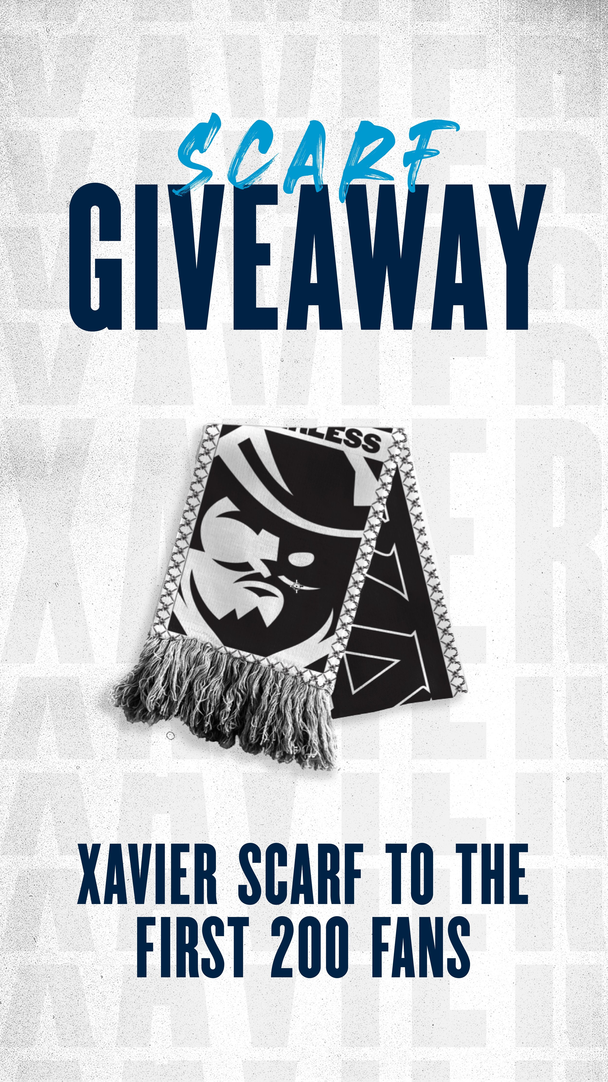
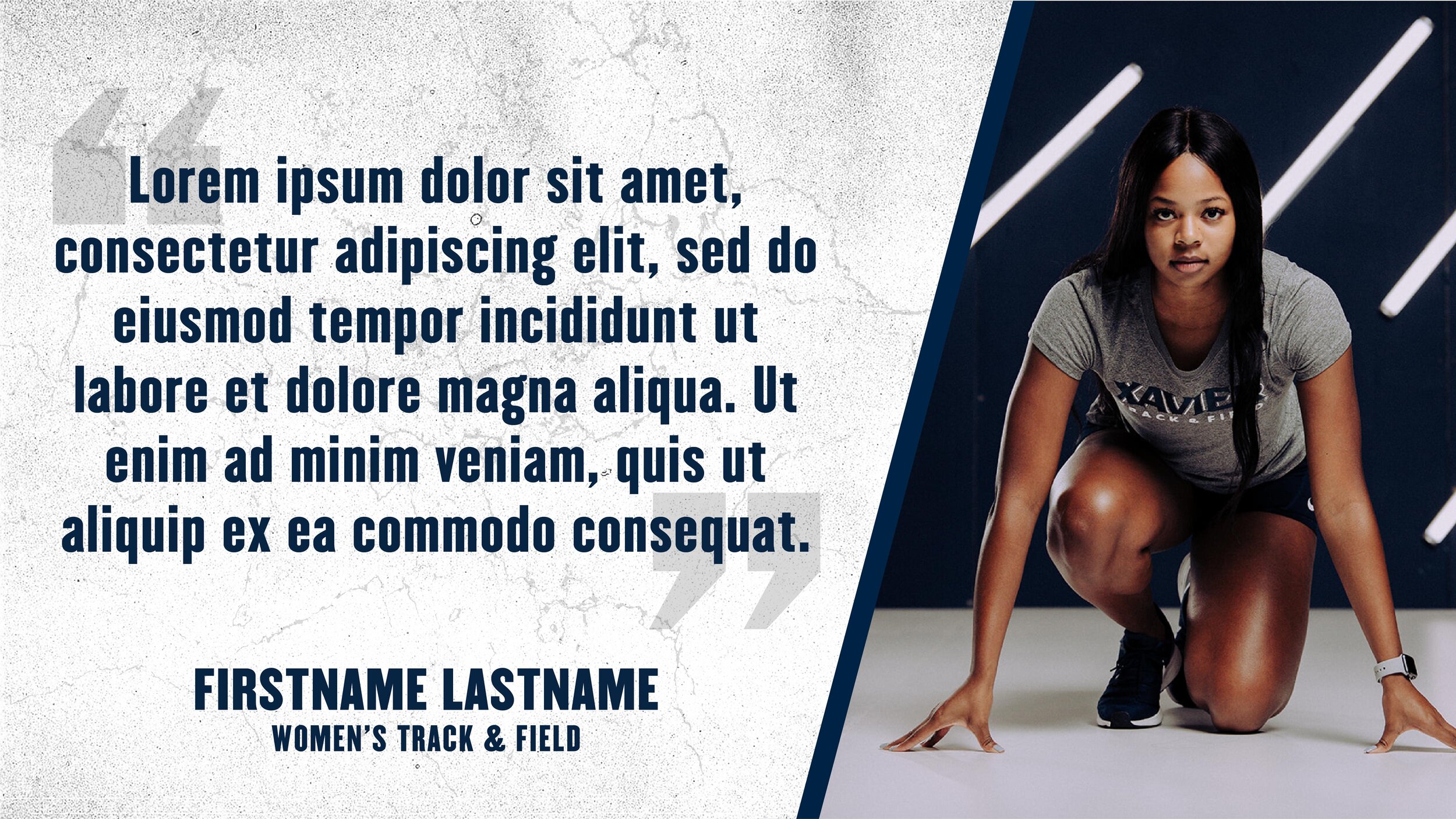
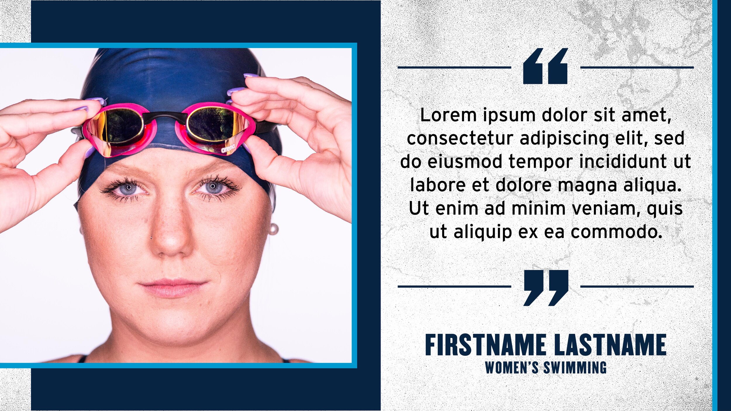
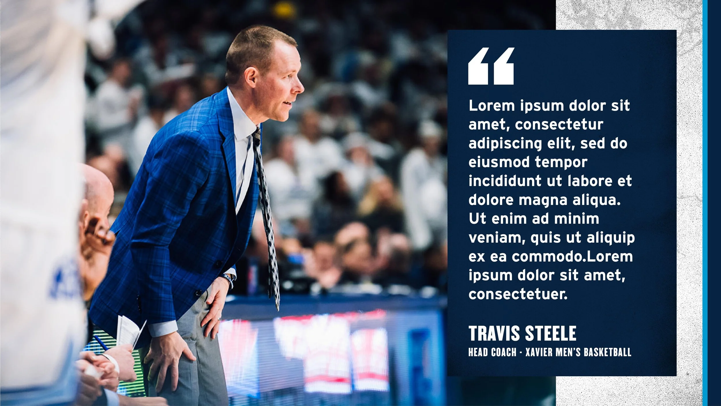
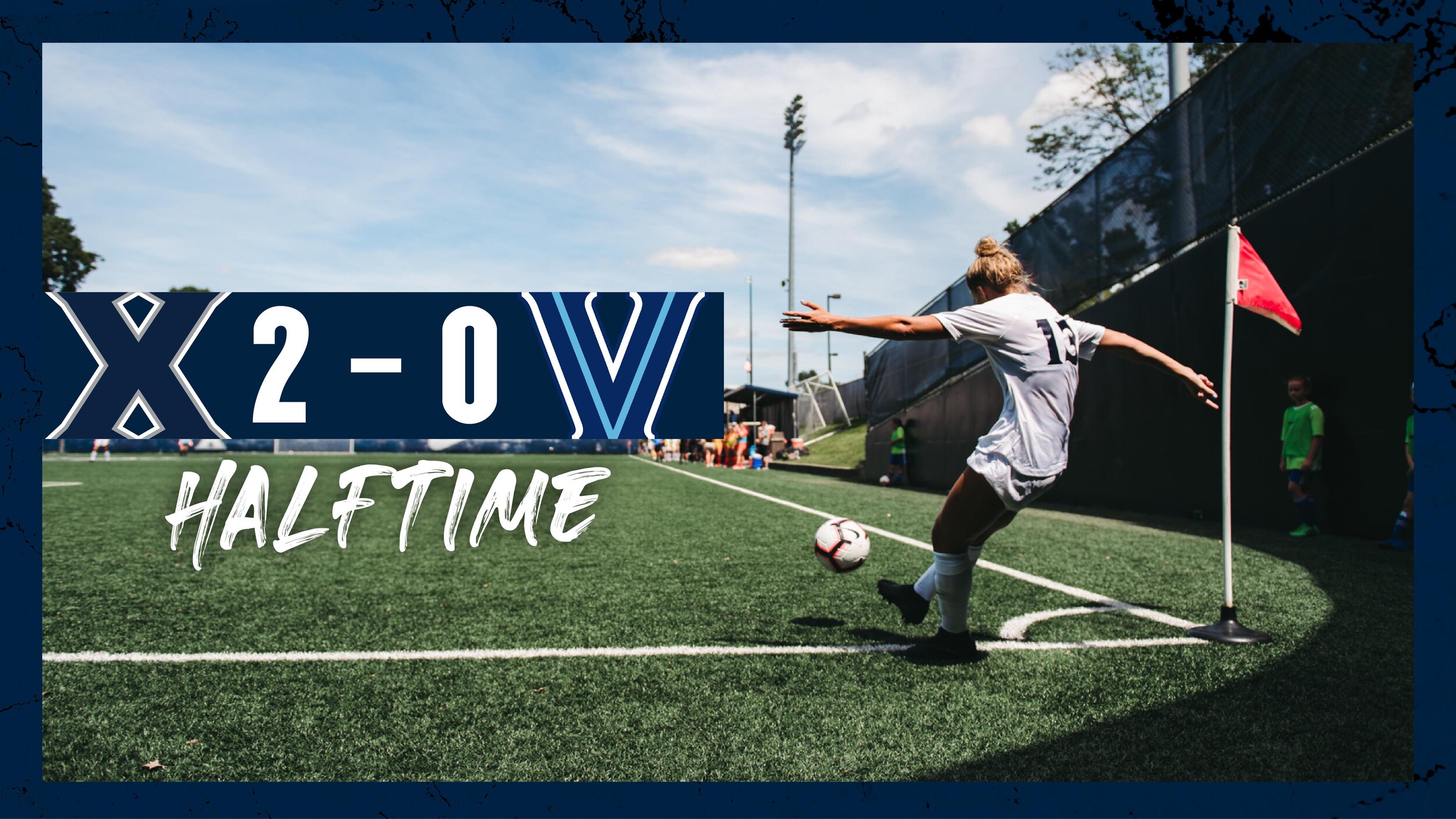
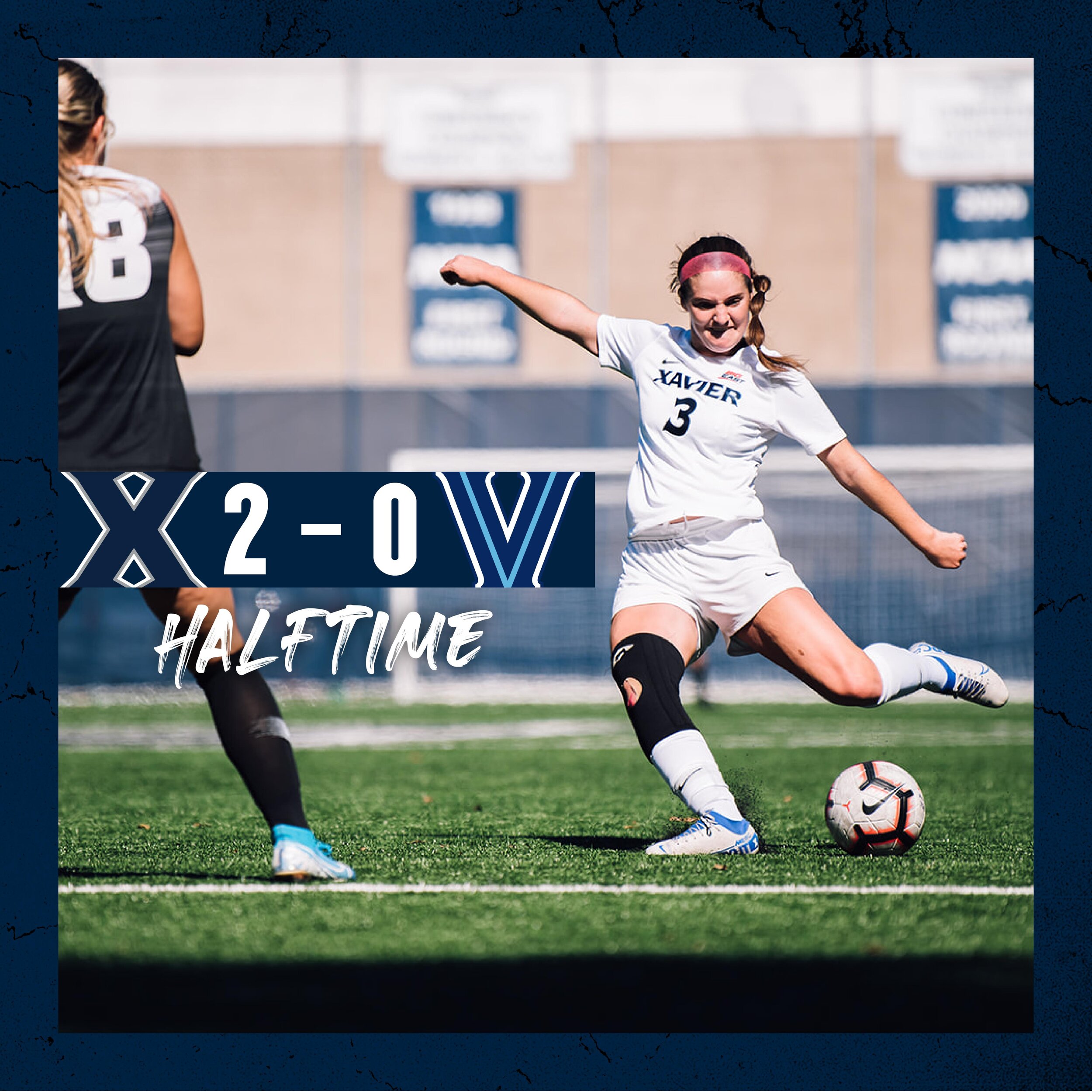
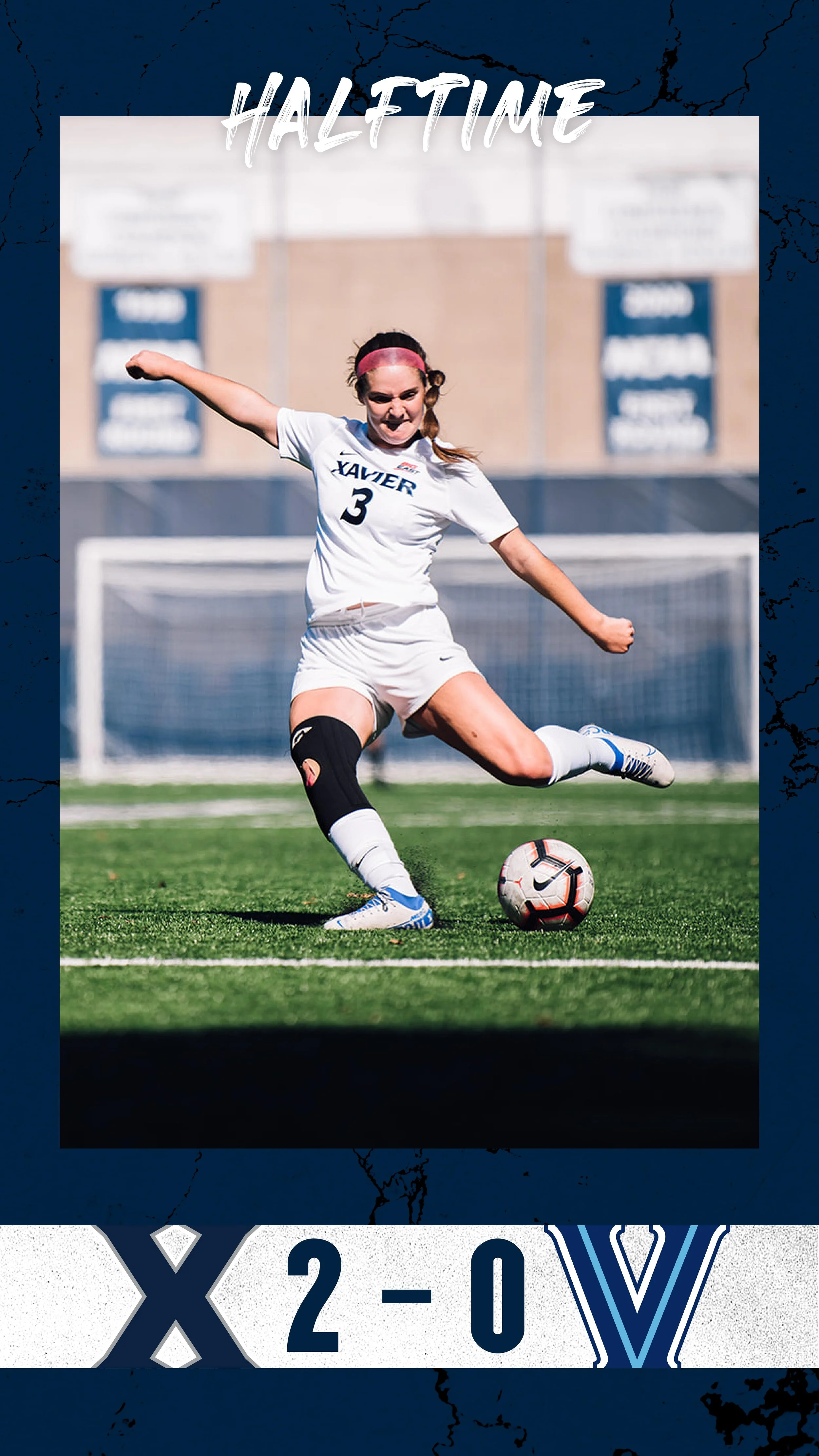
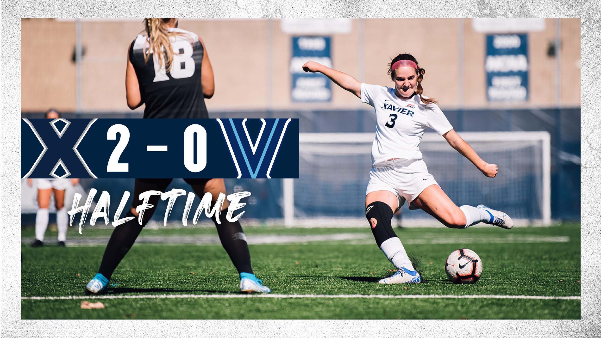
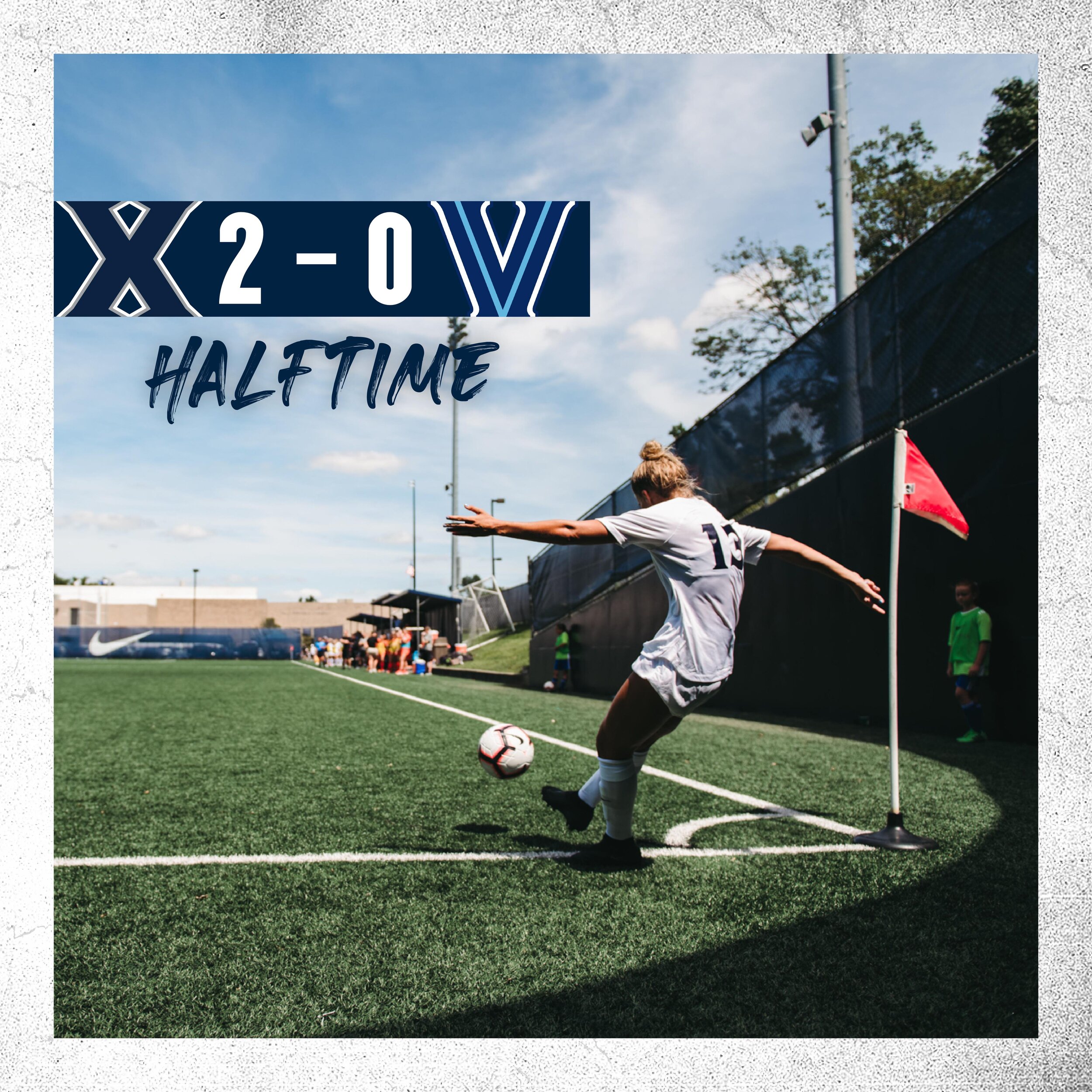
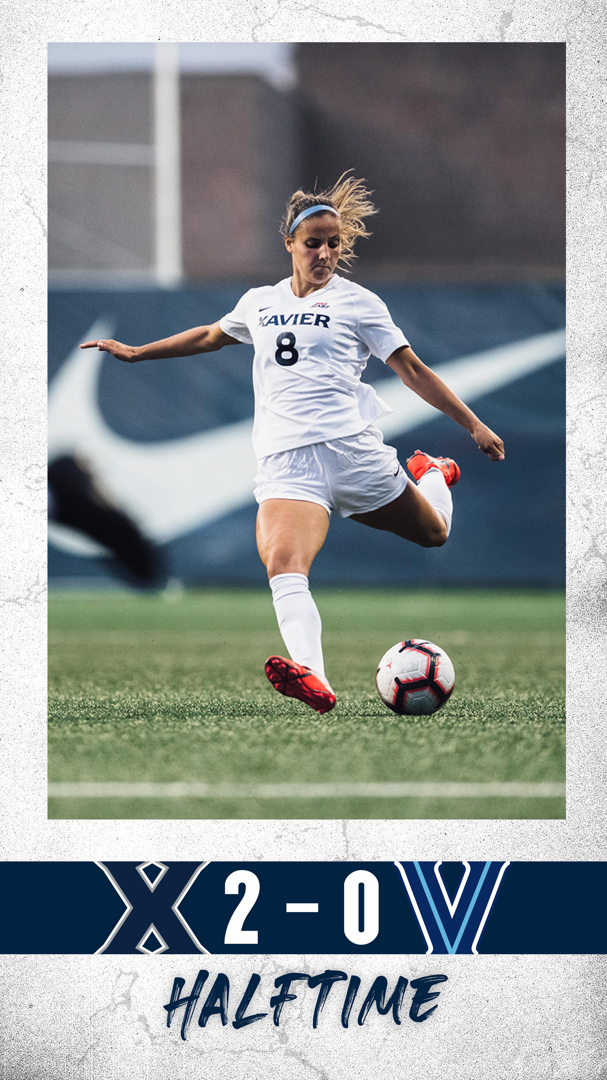
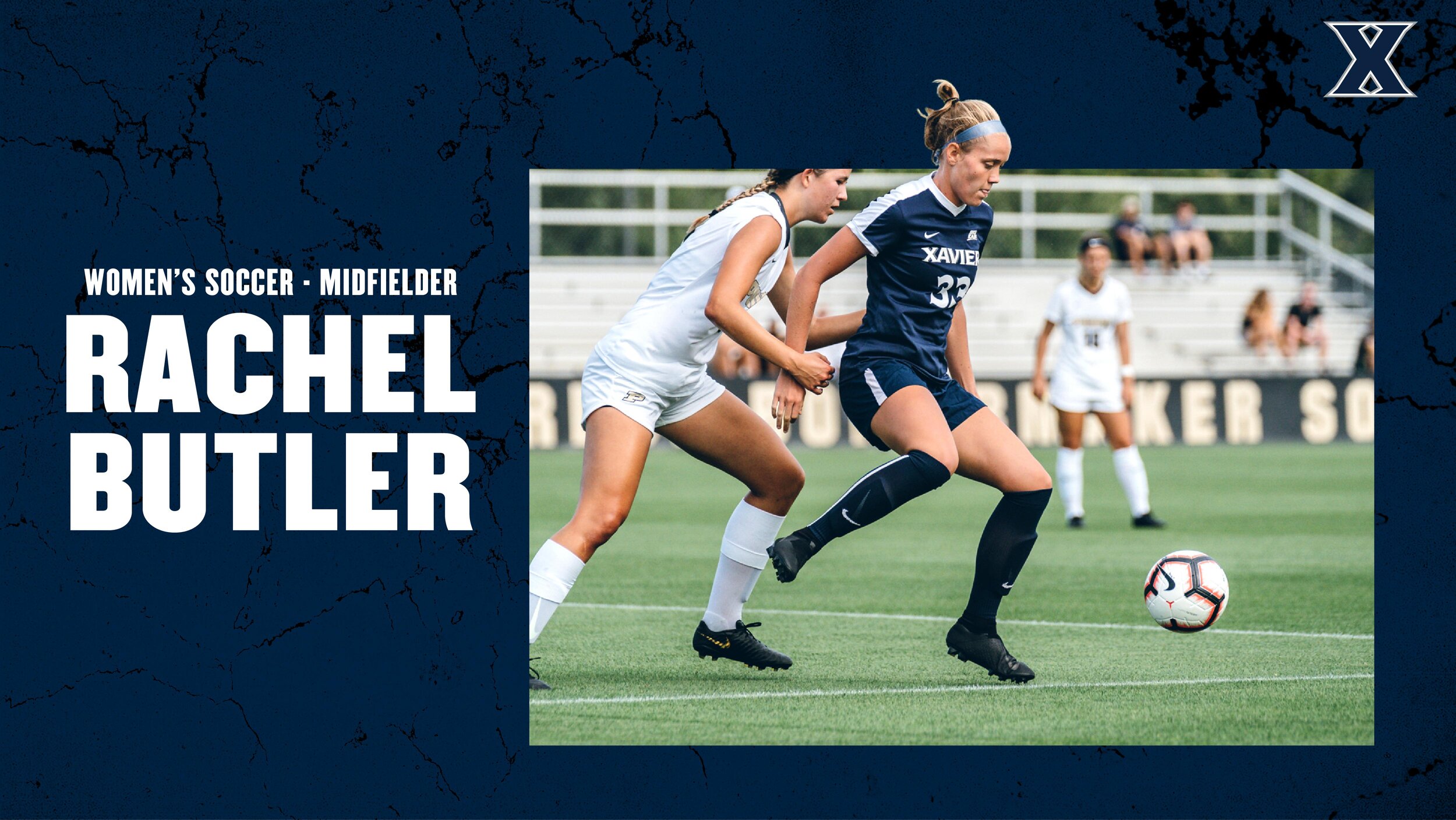
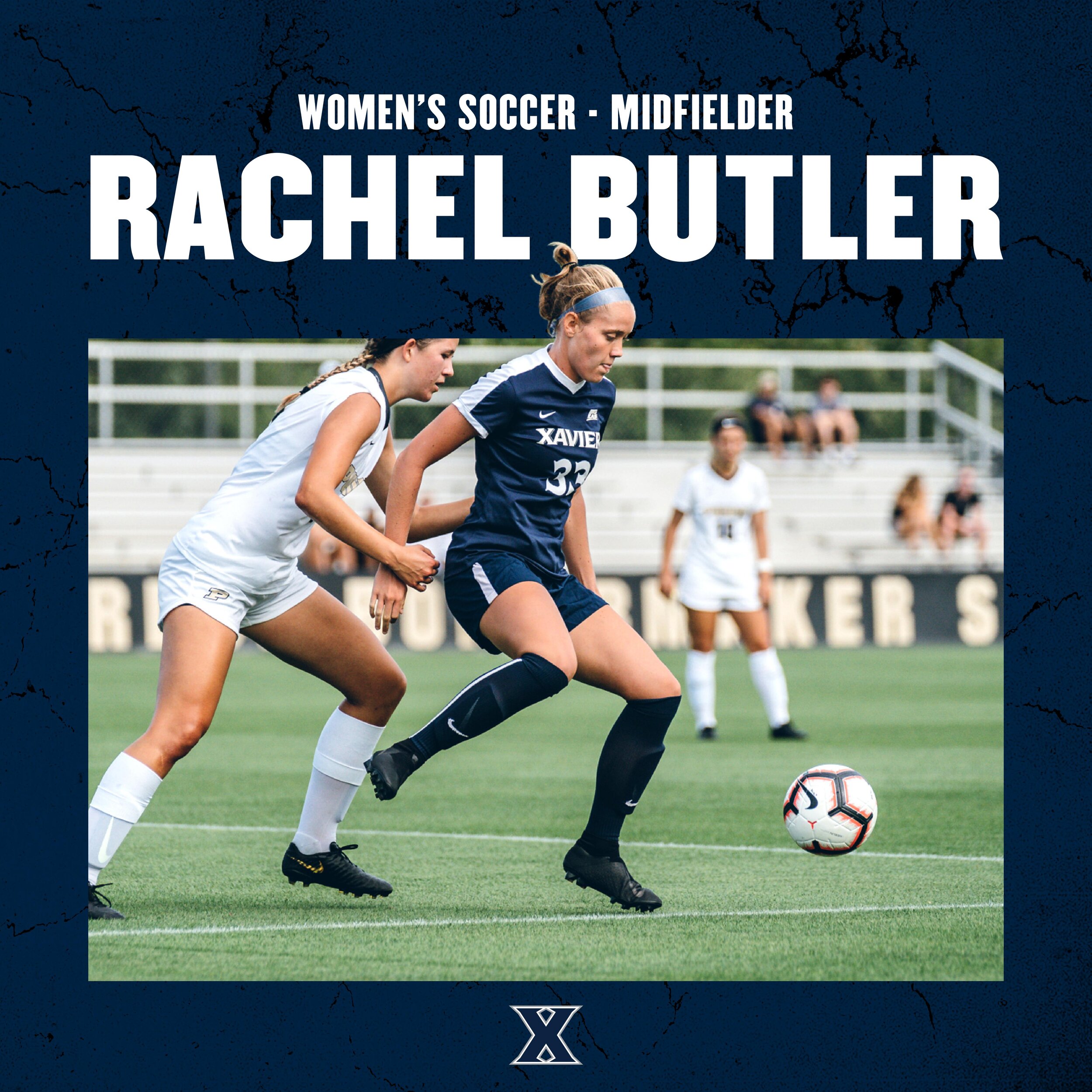
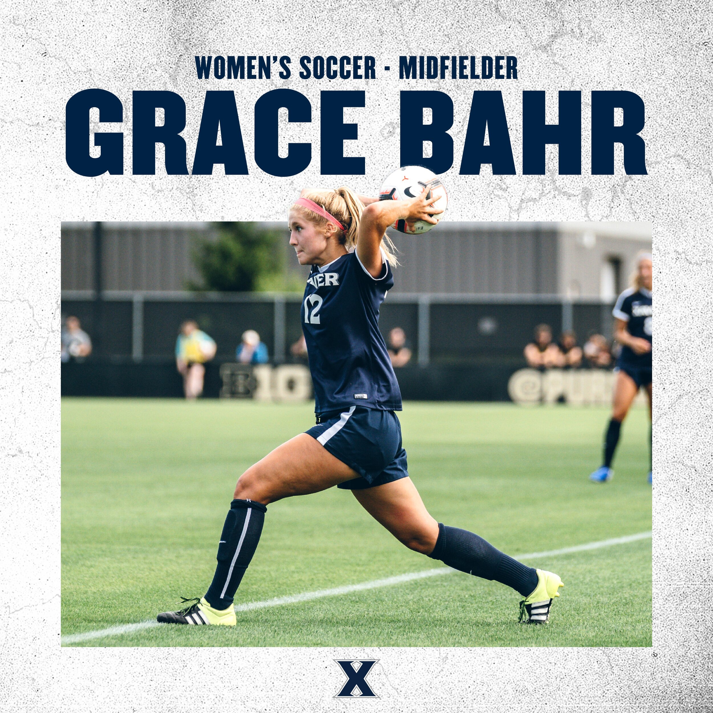
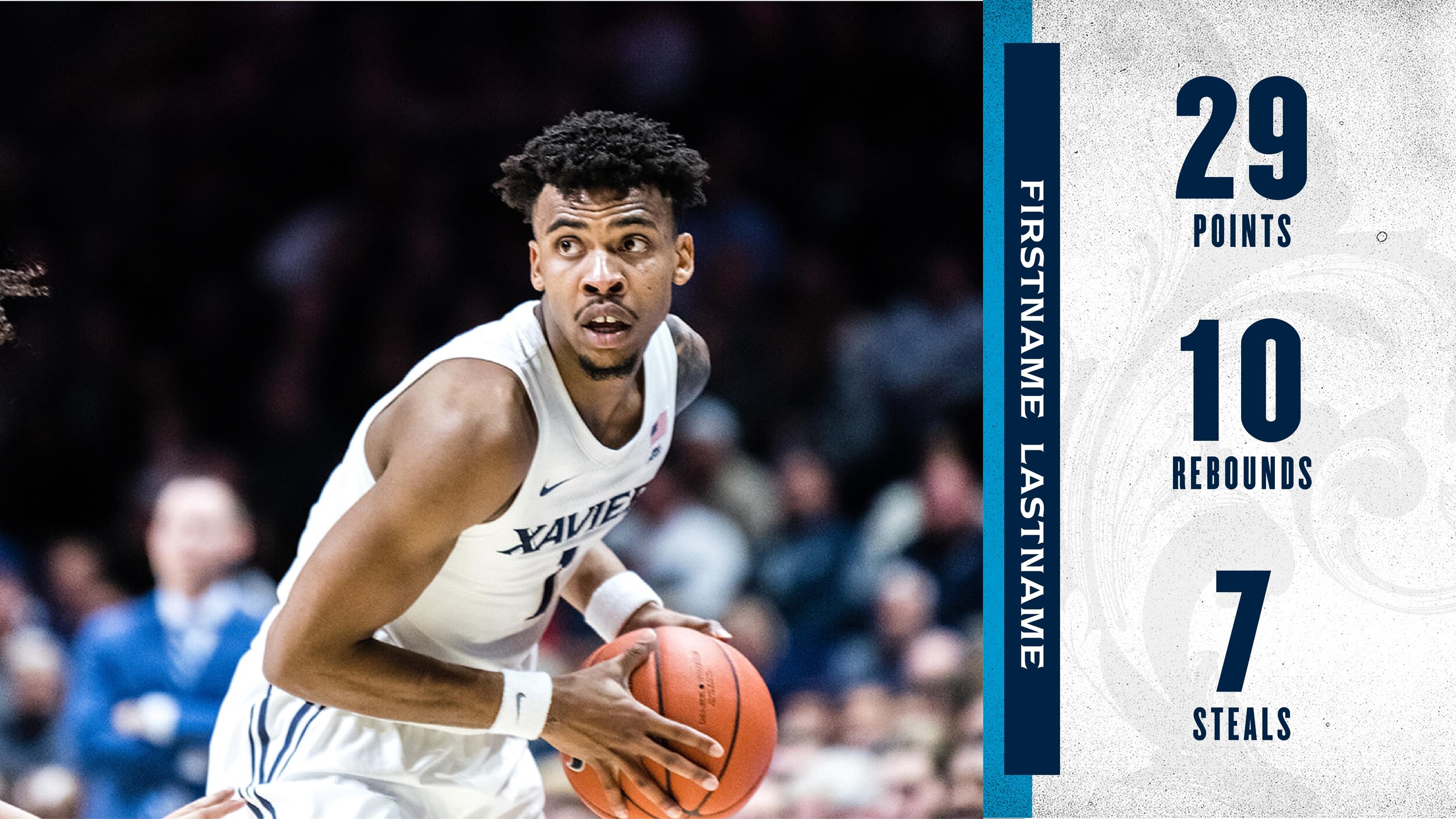
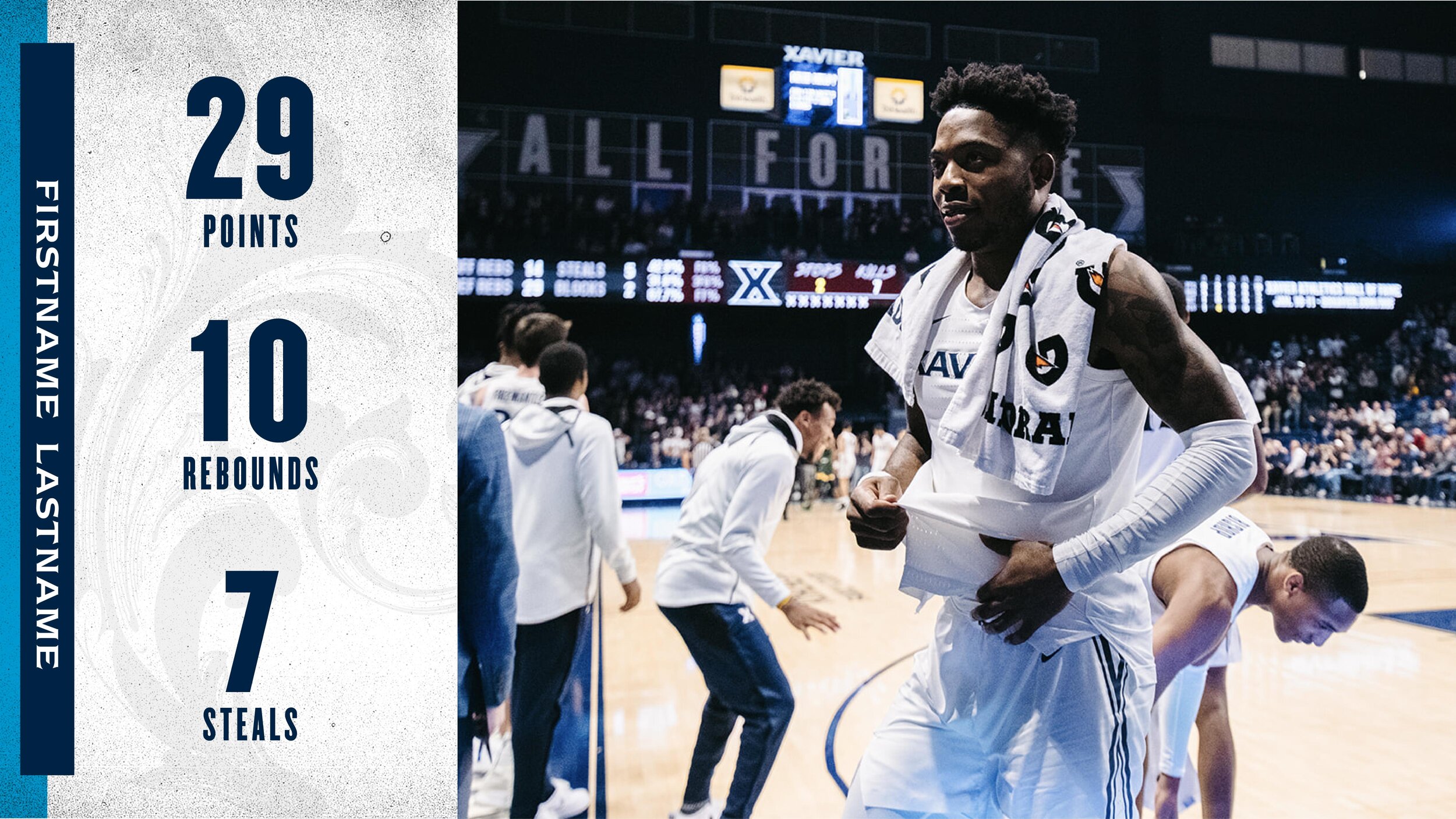
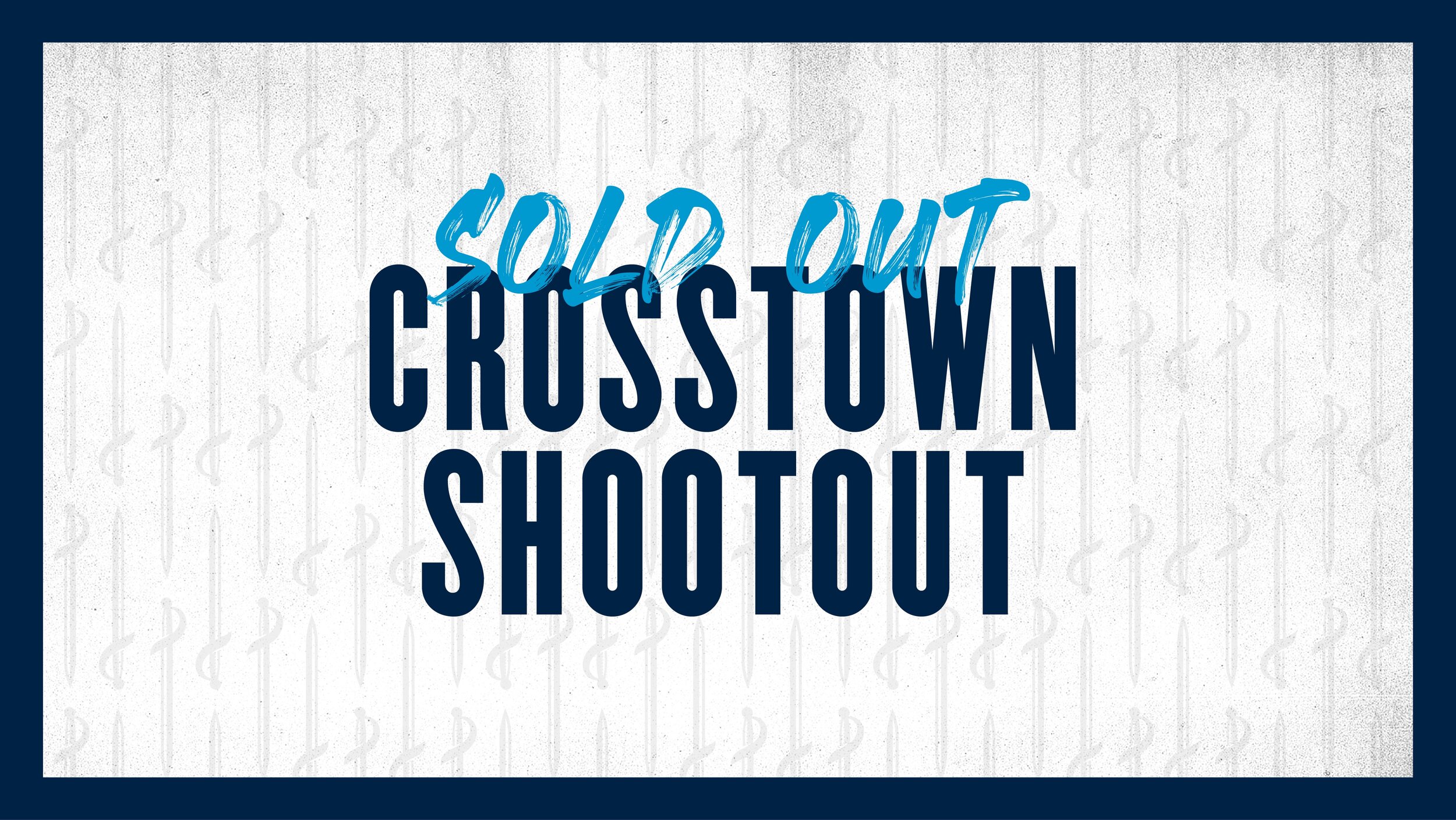
new graphic templates
Below is a collection of graphic templates for both the Marketing and Communications departments to use.
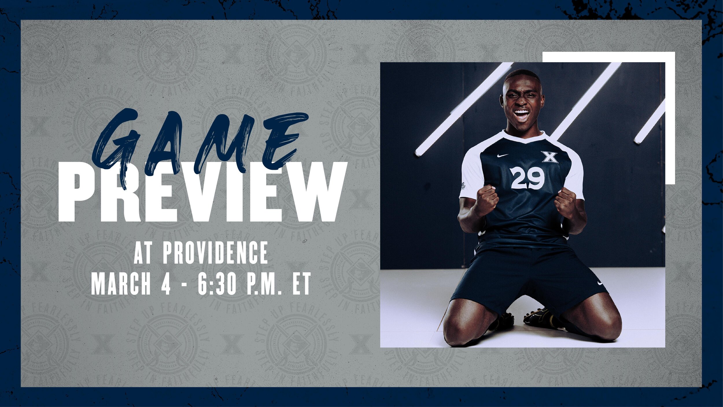
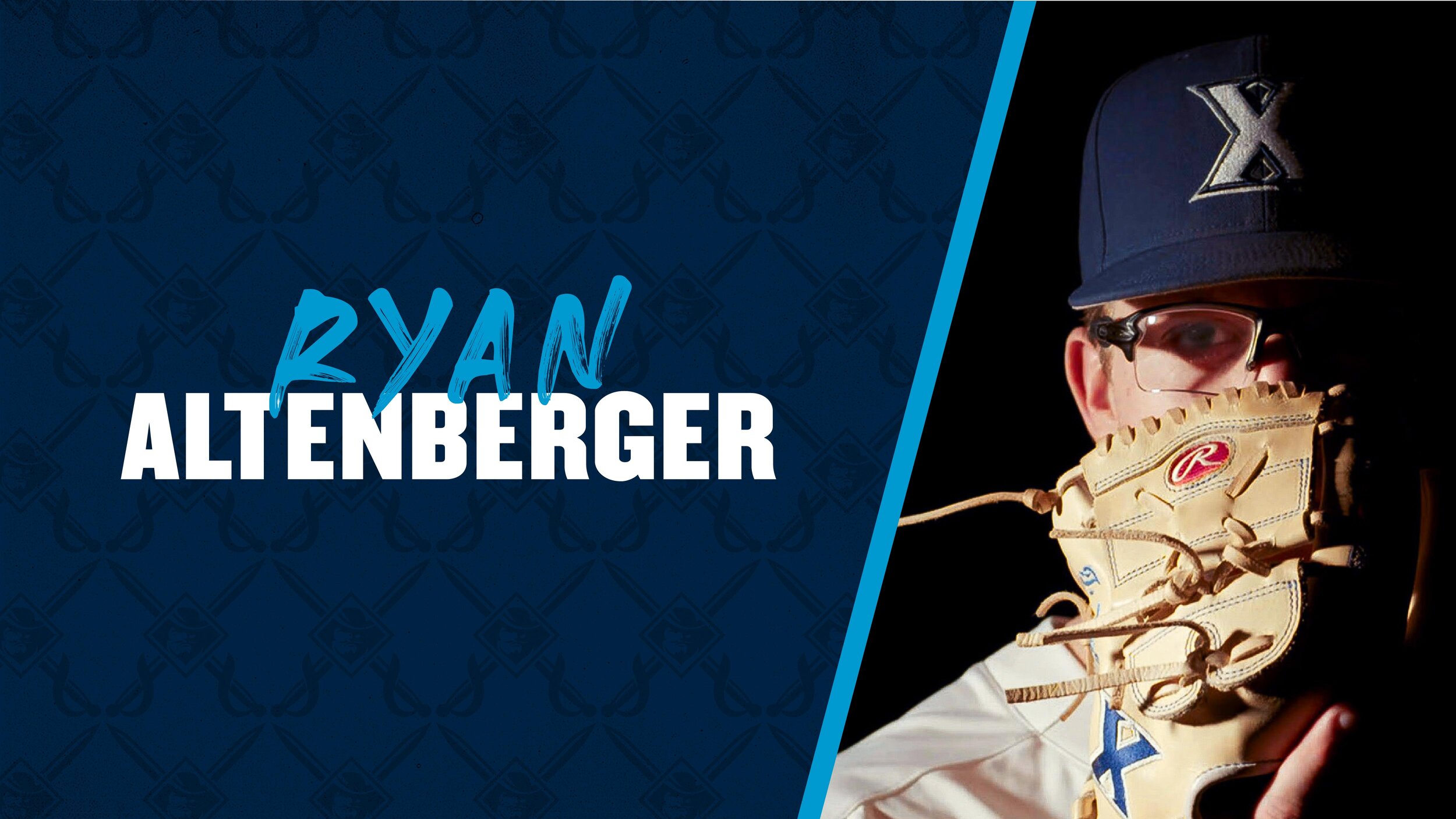
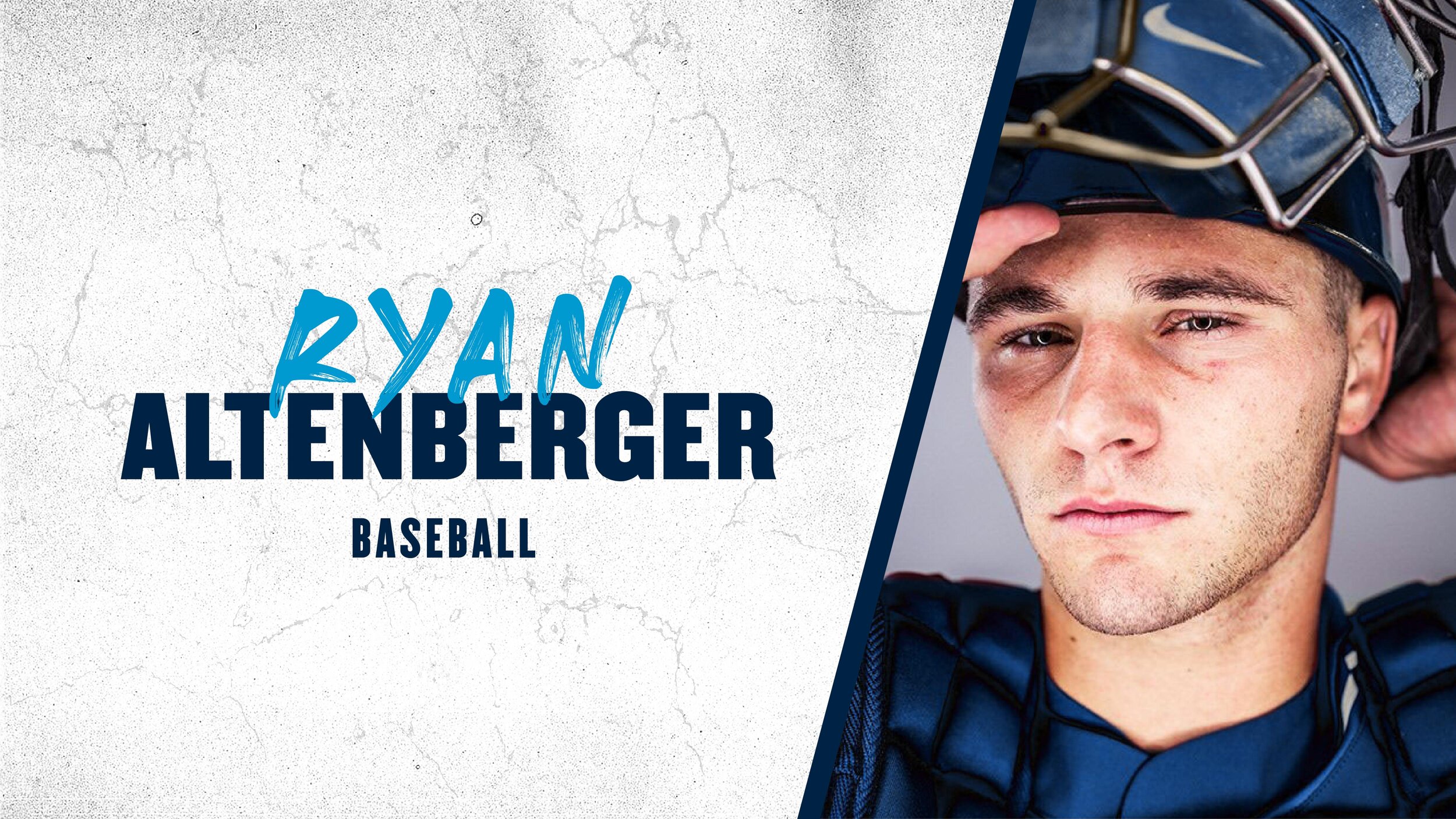
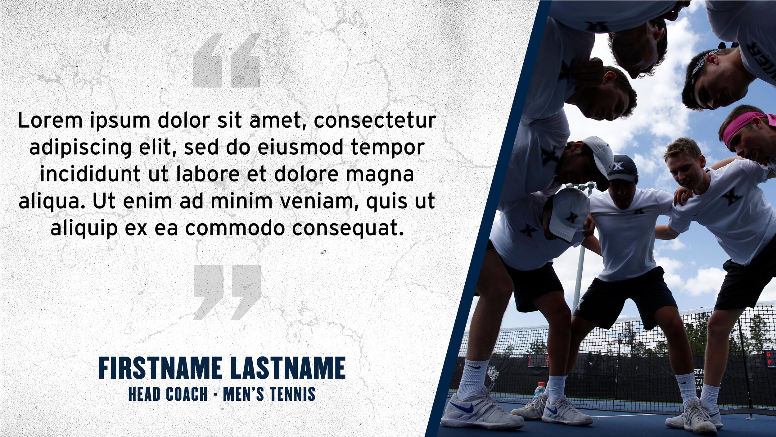
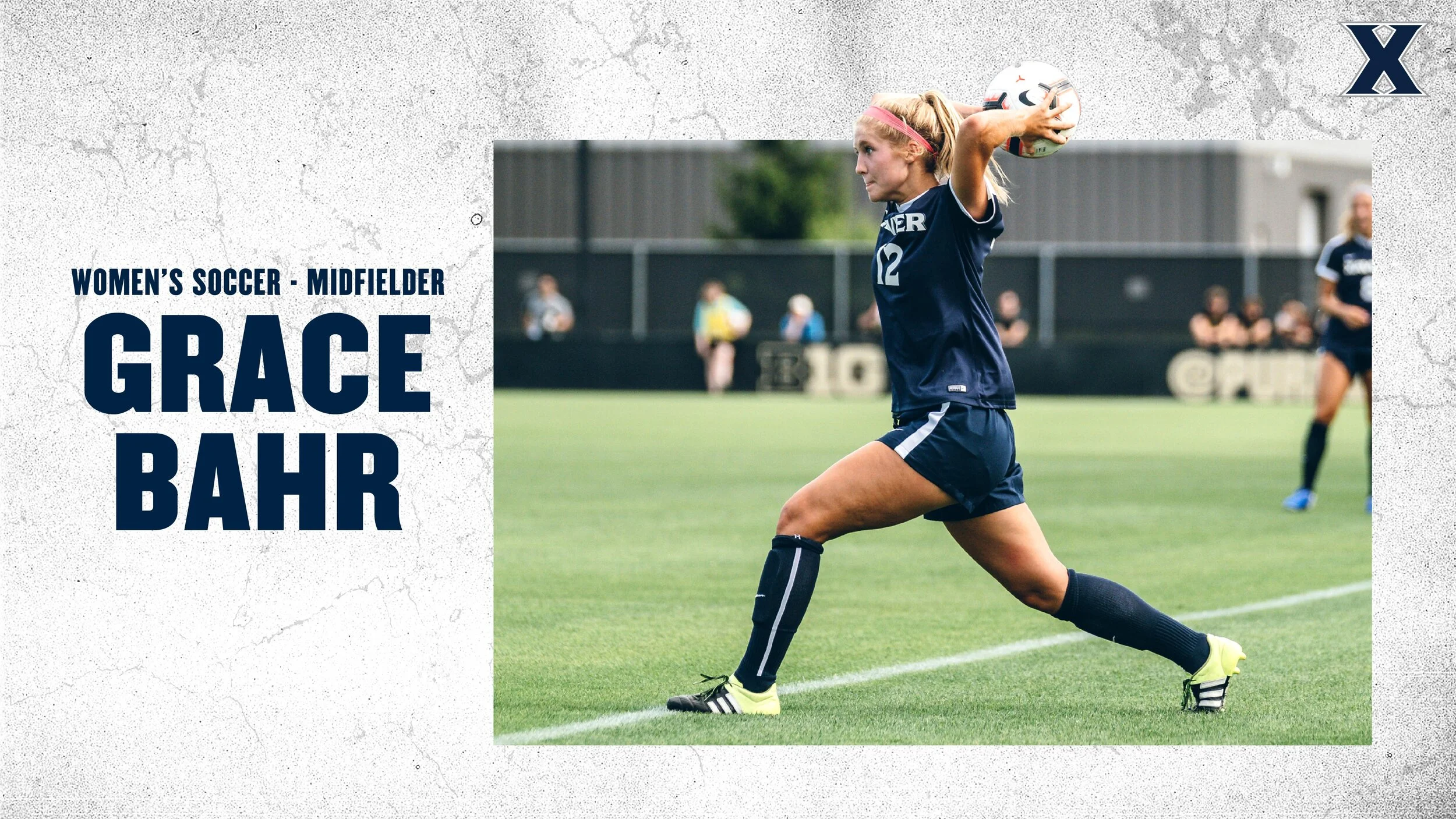


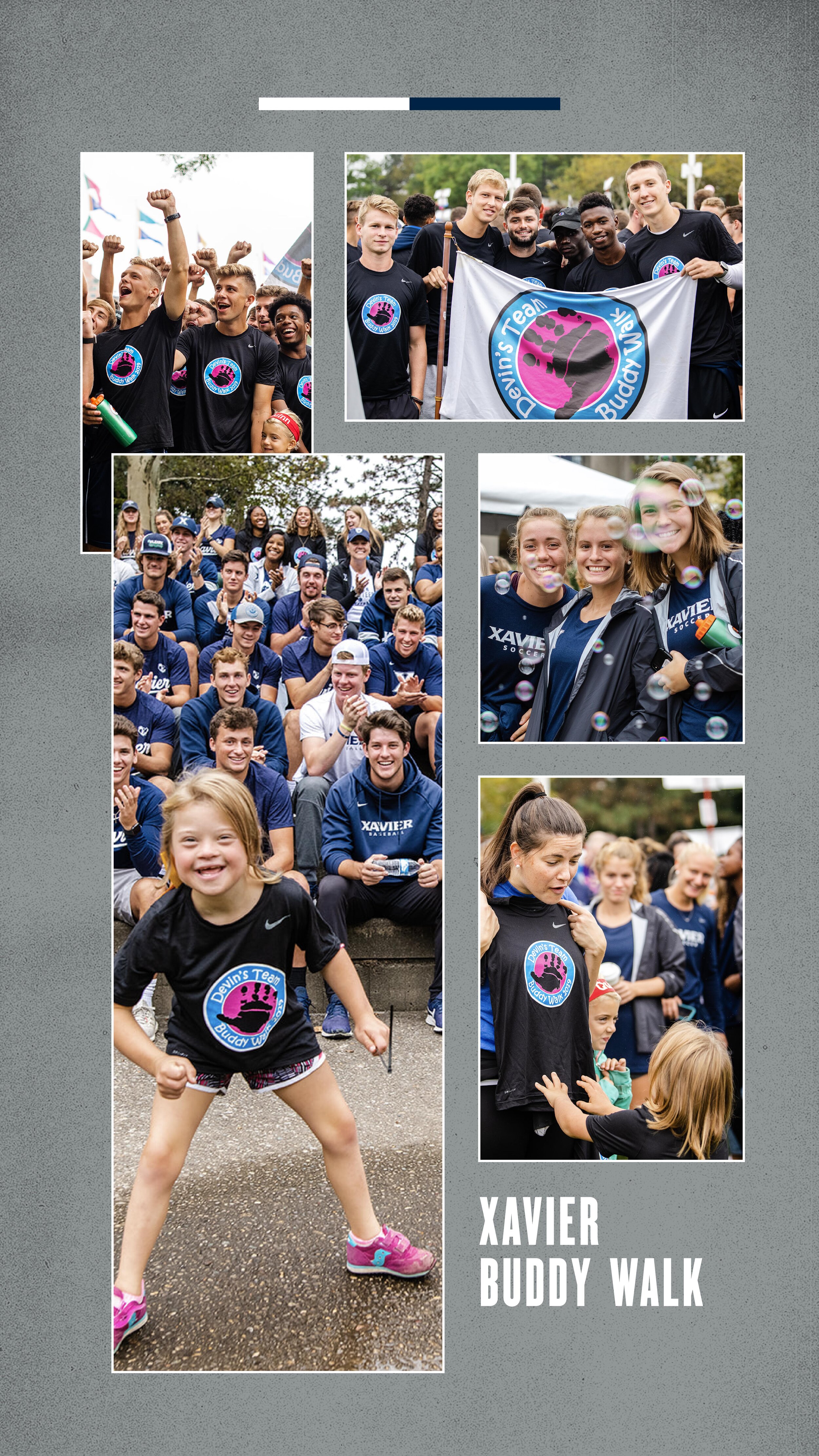
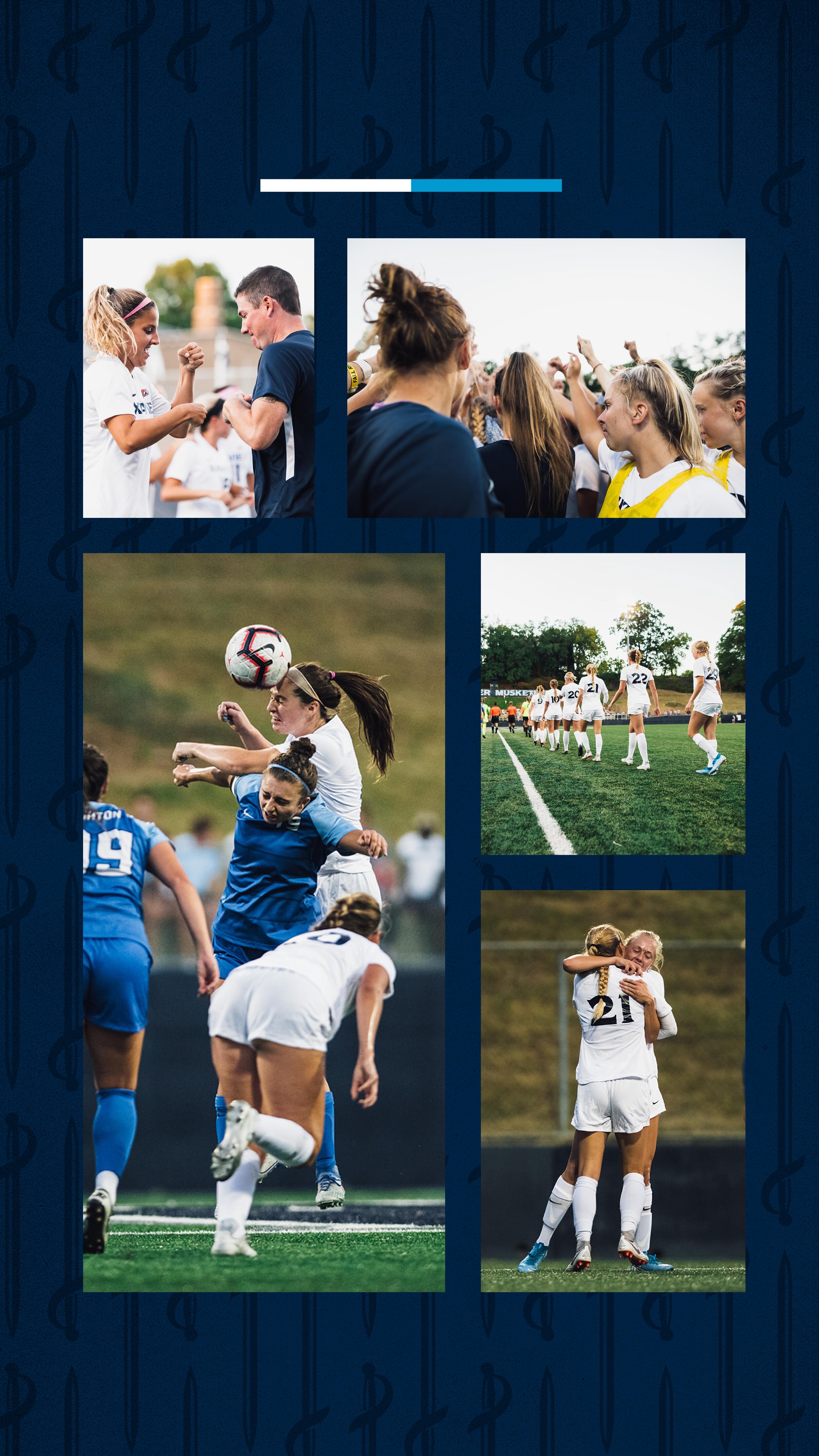
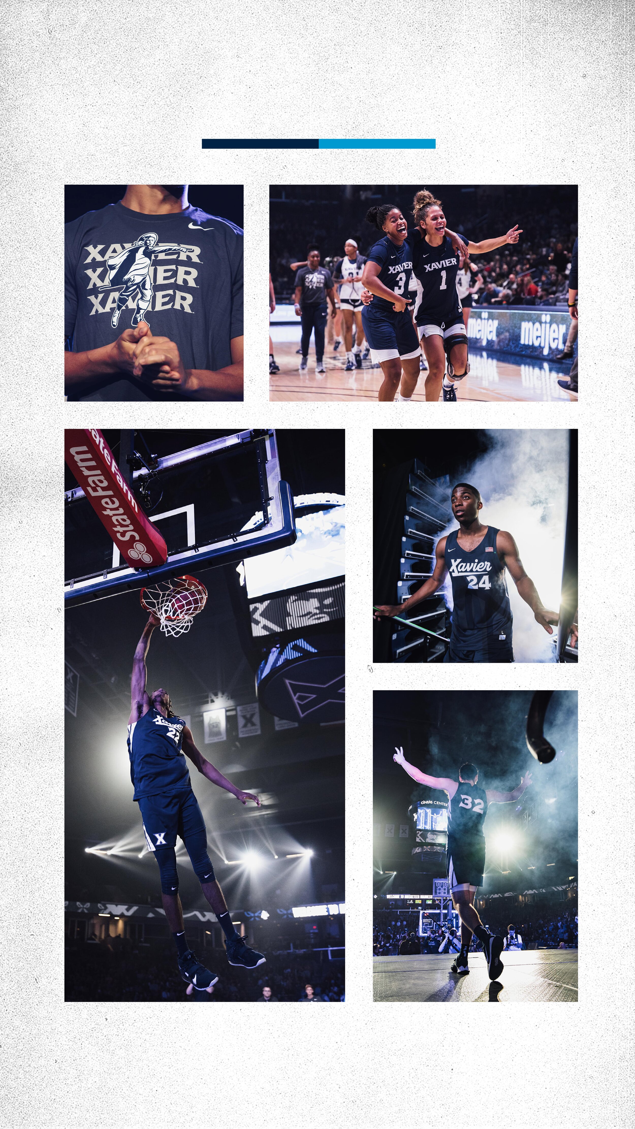
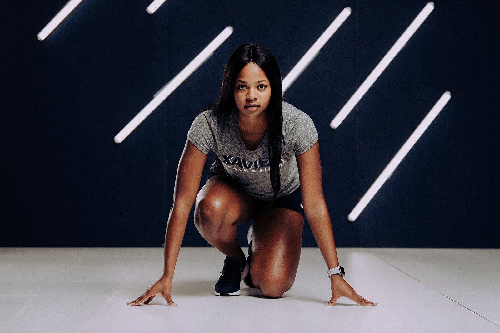
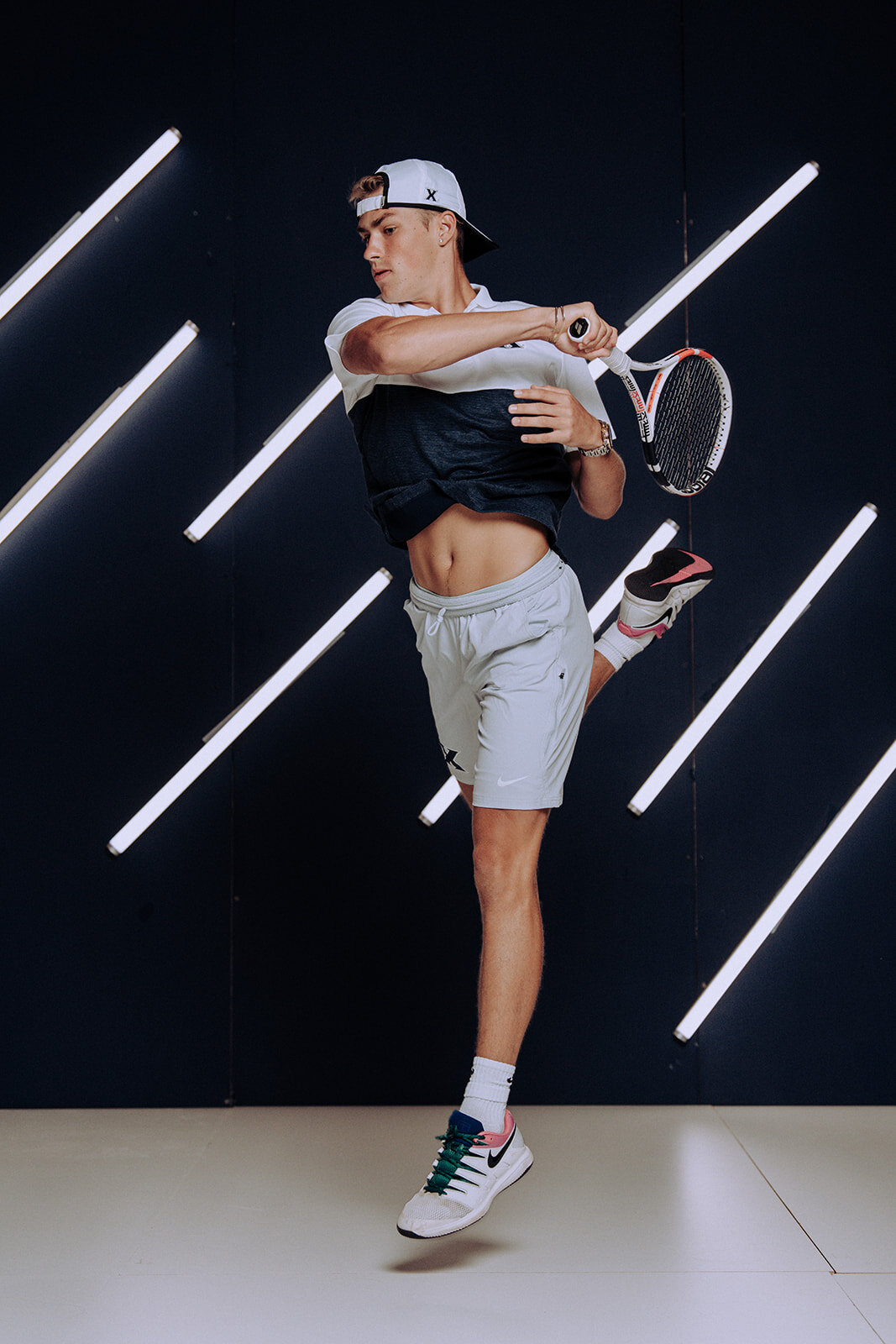
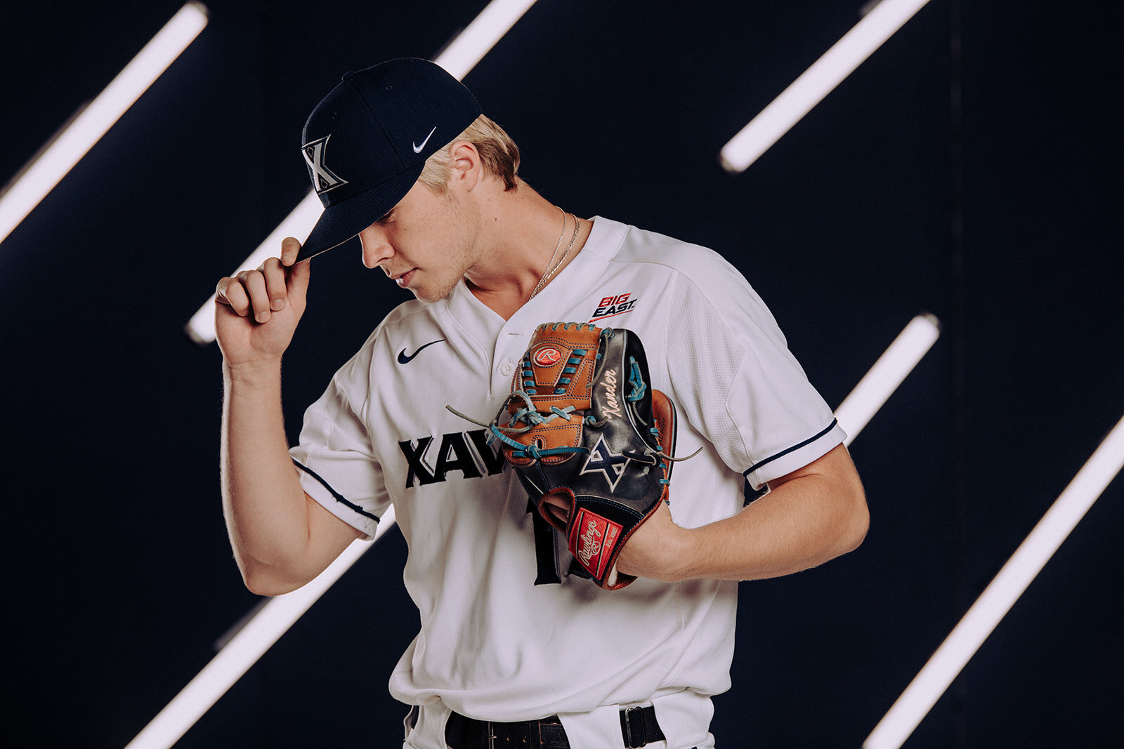
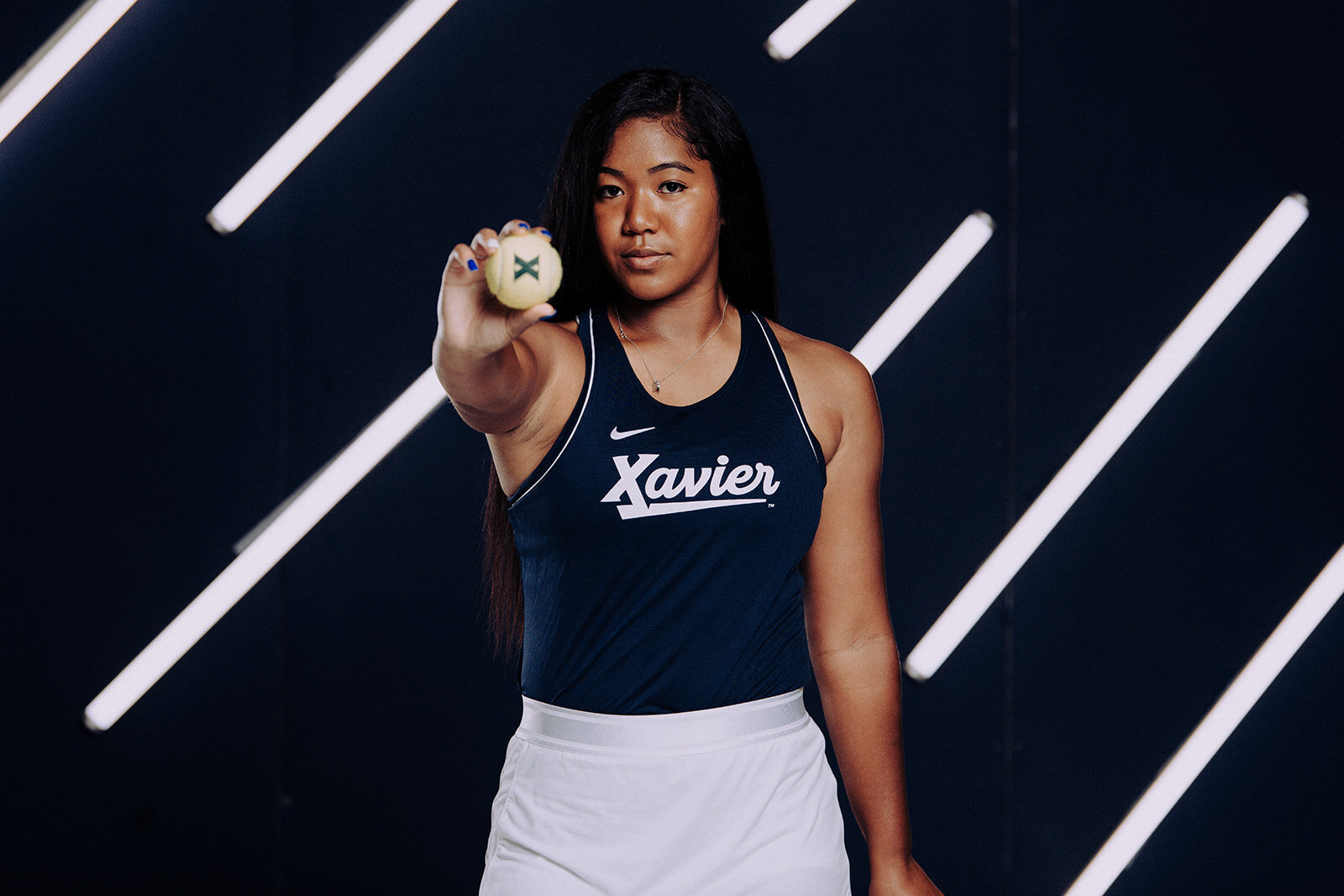
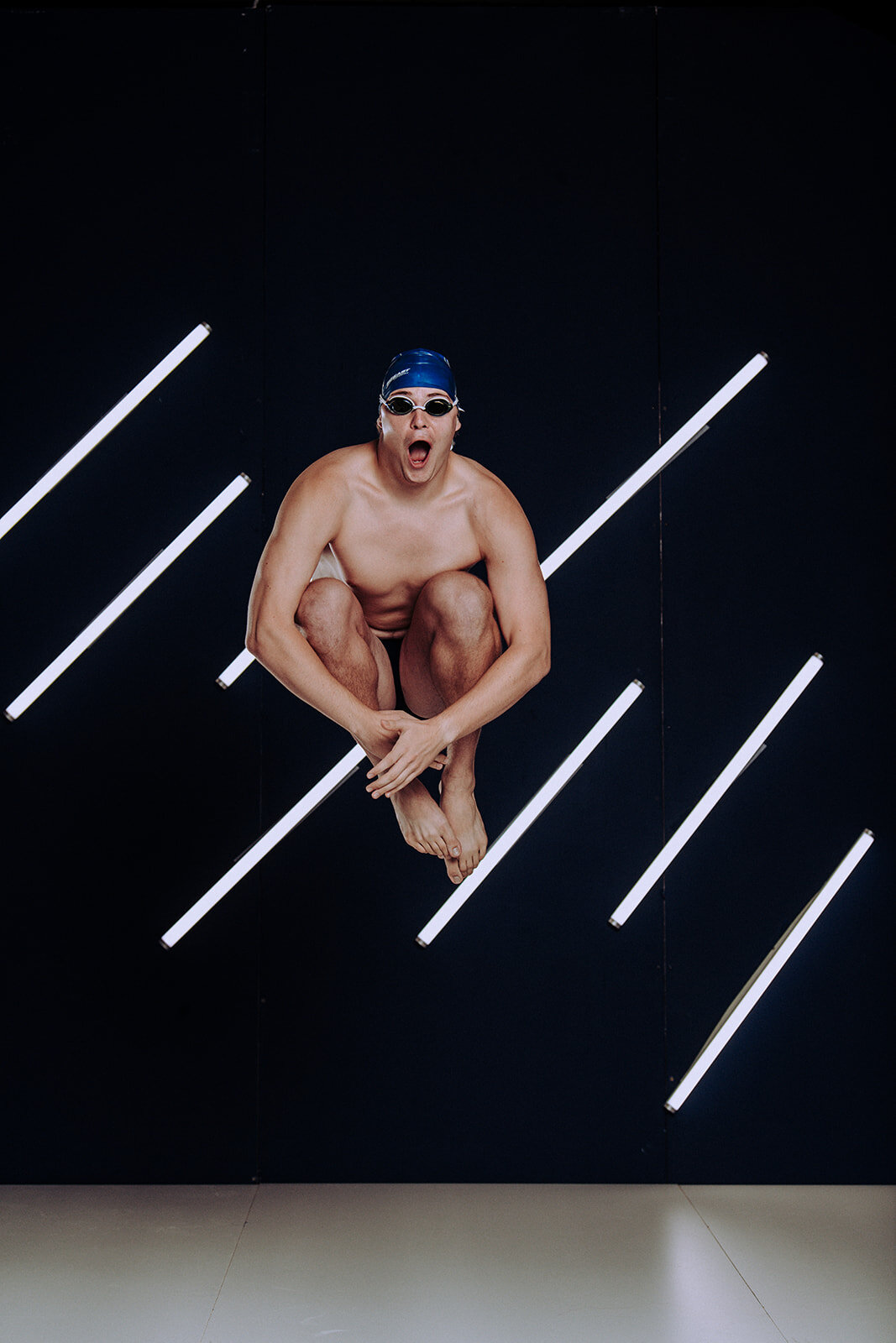
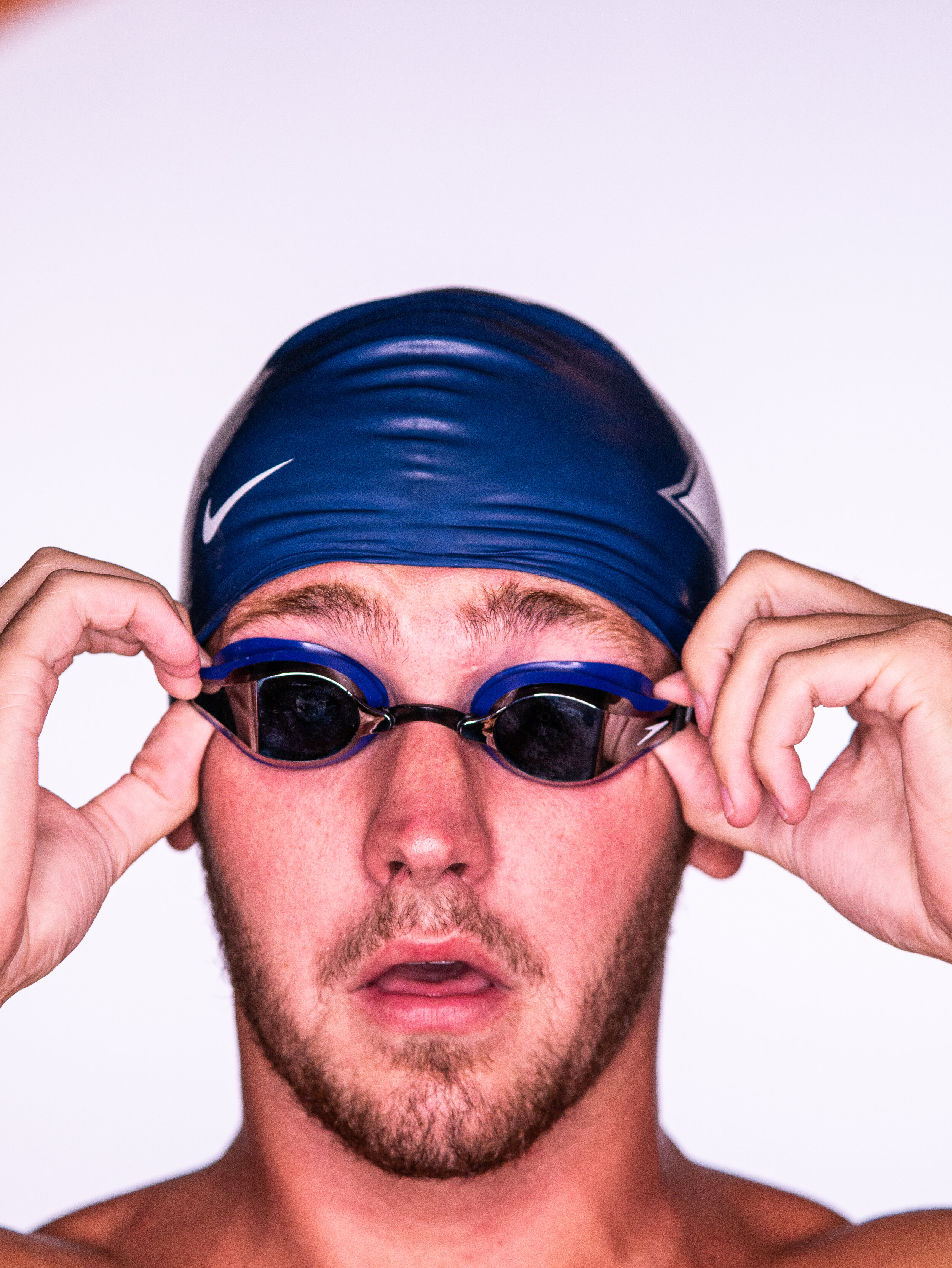
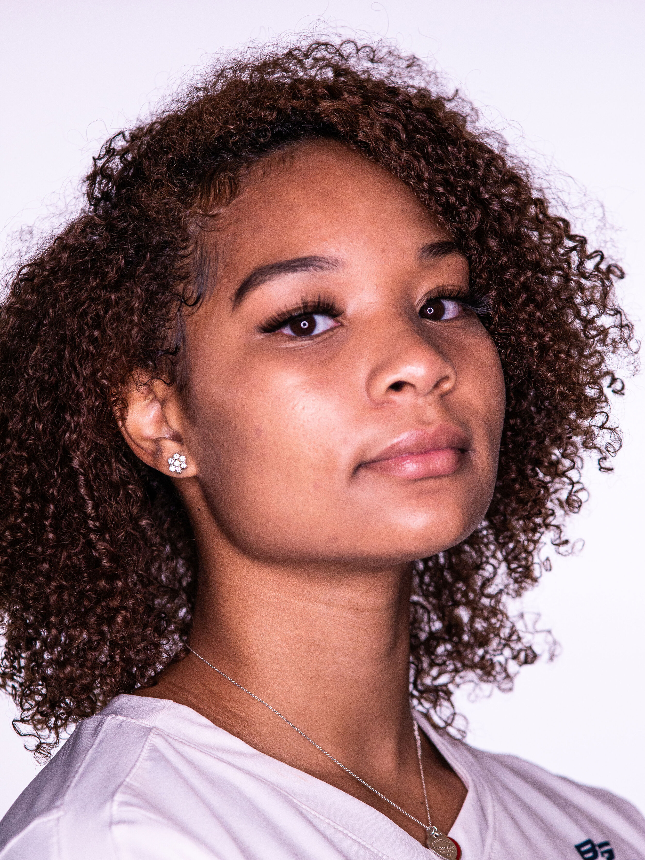
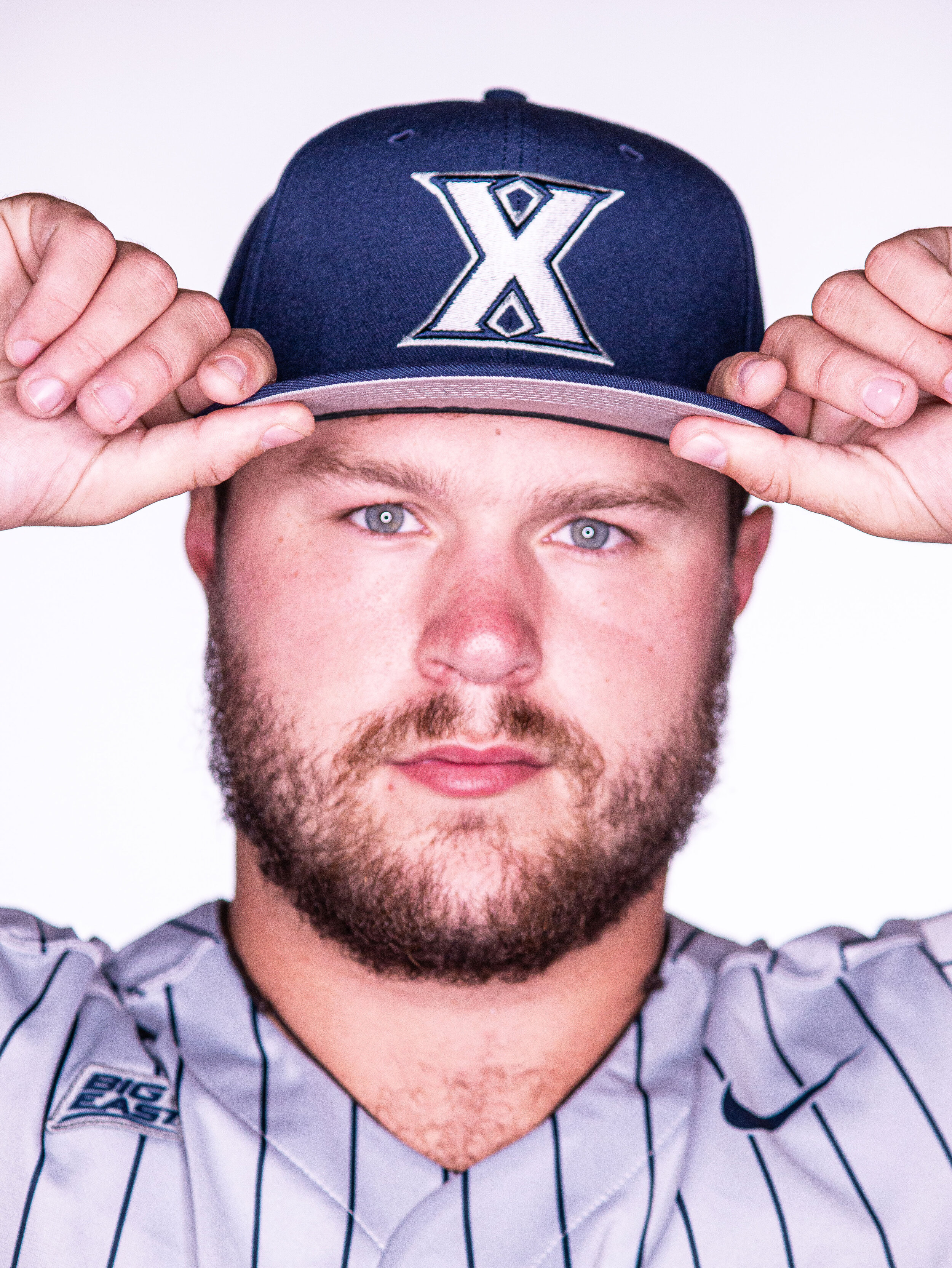
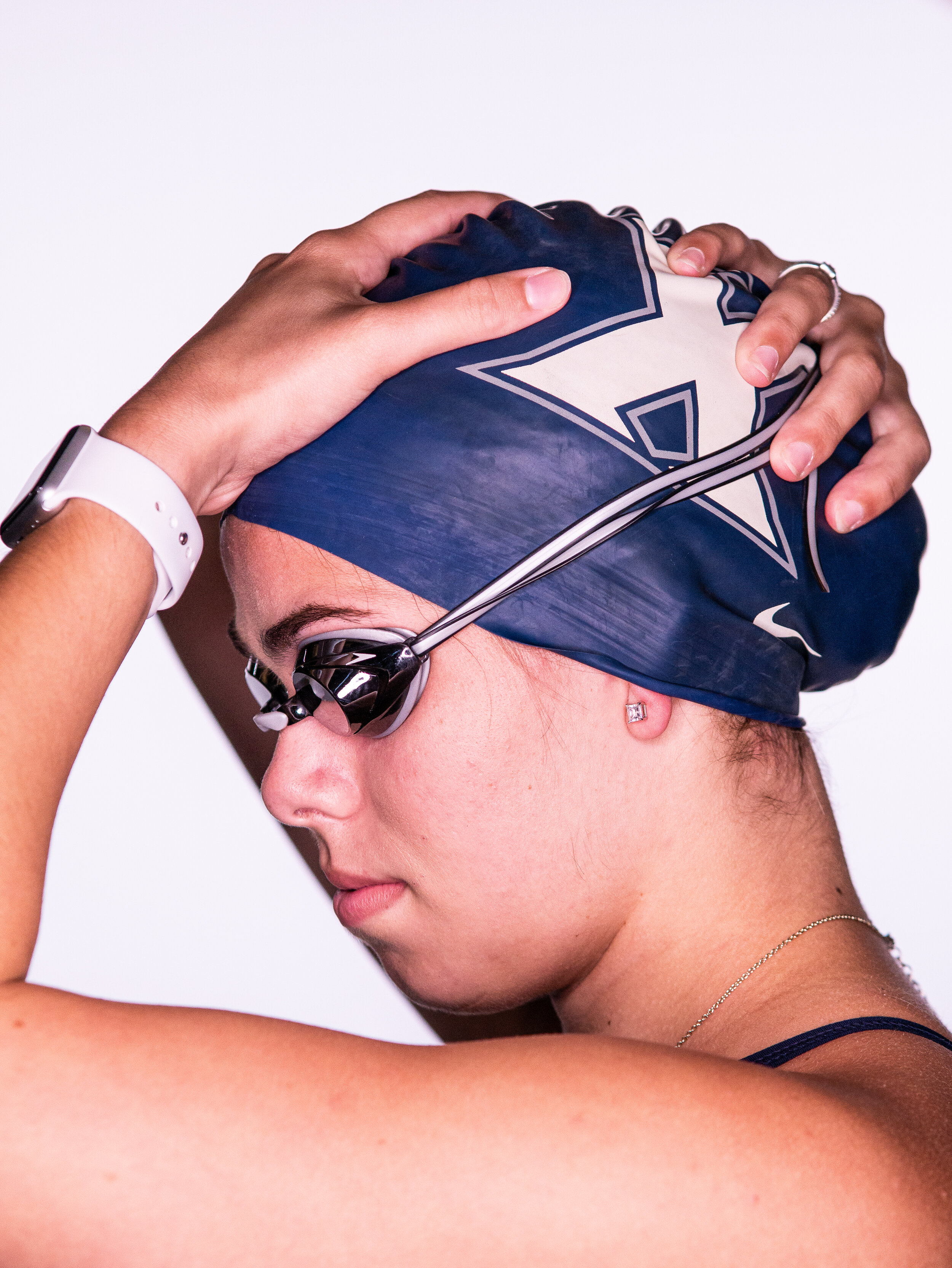
photography
Our new photography is full of personality and energy, conveying the enthusiasm of the athletes in every shot.